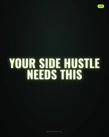
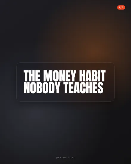
Grit Instagram carousel style
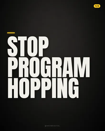
Grit is loud typography on a near-black canvas. The background here is a very dark charcoal with a subtle vignette, deepening at the corners so the type appears to float forward under a spotlight. The headline STOP PROGRAM HOPPING runs in a heavy condensed sans, off-white rather than pure white, set in three tight all-caps lines that fill the frame almost edge to edge. The letterforms are packed with minimal tracking and near-zero leading, so the words stack like breeze blocks. A single mustard-yellow bar sits above the first line as the only accent colour, and a small rounded pill in the top right reads 1 / 5. A faint @AKZMDIGITAL handle sits centred at the foot in muted grey. That is the whole kit: no photography, no gradients, no decoration. Grit stops scrolls because it behaves like a shout. The scale of the type is aggressive, the contrast between cream letters and black ground is stark, and the message lands before anyone decides whether to keep swiping. The lineage is gym-poster and streetwear drop culture, the black-and-cream of hardcore band merch, the brutalist bark of motivational fitness reels. It borrows the confidence of a sports brand billboard where the copy is the entire image. The mood is direct, a little confrontational, unbothered by softness. Because there is no imagery to interpret, the reader has nothing to do but read, and the condensed weight makes even a plain sentence feel like a command. It suits punchy, opinionated statements far better than nuance, and the yellow bar is doing careful work, giving the eye one warm anchor so the slab of text does not read as flat.
Best for
The single mustard bar is the whole palette, don't add a second colour
Grit gives you black, cream and one hit of yellow. That restraint is why the type reads as decisive rather than busy. The moment you introduce a second accent, blue for a link, red for emphasis, the slide loses its billboard authority and starts to look like a template with the fields filled in. Let the yellow bar mark the start of the thought and leave every other emphasis to size and line breaks. One colour makes a statement look owned. Two makes it look designed by committee.
Break the line where you'd take a breath, not where the box ends
STOP PROGRAM HOPPING works because each word gets its own line, so the eye hits a full stop three times. With condensed all-caps at this scale, where you break the line is the entire rhythm of the slide. Don't let words wrap wherever the margin runs out. Choose your breaks so each line is a beat you could say out loud. A stray orphaned word on a fourth line kills the stacked-block effect that makes Grit feel deliberate and heavy.
Wrong for anything that needs a gentle tone
This look shouts. That is perfect for a challenge, a hard truth or a contrarian take, and completely wrong for grief, wellbeing, careful advice or luxury. Set a condolence message or a spa launch in all-caps condensed on black and it reads as anger, not warmth. If your copy contains the words gentle, calm, nurture or restful, pick a softer skin. Grit only earns its confrontational weight when the message actually wants to grab someone by the collar.