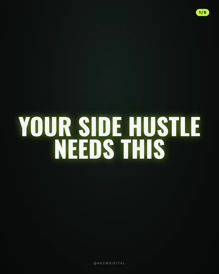
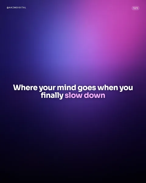
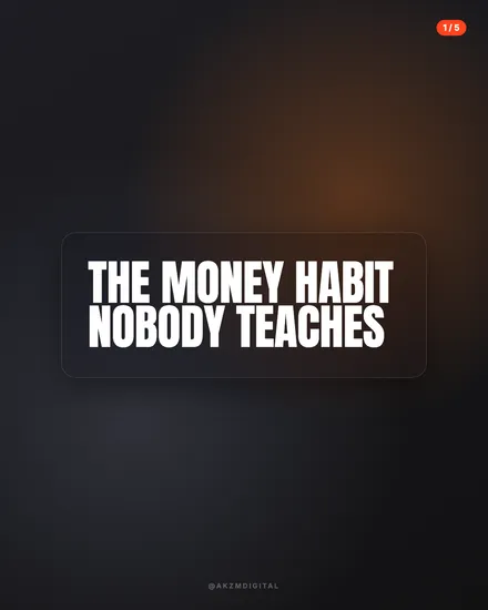
Neon Instagram carousel style
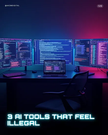
Neon builds each slide as a dim, cinematic scene lit almost entirely by screen glow and coloured light. In this example a three-monitor coding desk sits in near darkness, the wall behind washing from deep electric blue on the left into a hot magenta and crimson on the right. The monitors spill cyan and violet code across the desk, a laptop between them throws its own smaller pool of light, and an empty chair keeps the foreground in shadow. It is a very specific mood: late night, powered on, nobody home but the machines still running. That colour split is the whole trick. Neon almost never uses a flat backdrop. It leans on two clashing lights, cool against warm, so the frame has depth and a sense of place before you read a word. The headline, "3 AI TOOLS THAT FEEL ILLEGAL", sits bottom-left in a bold condensed sans with a soft cyan glow lifting it off the dark desk, echoing the same blue as the screens. Small touches hold it together: the "@AKZMDIGITAL" handle top-left, the "1/5" pager top-right, both quiet and low-contrast so the light does the shouting. The lineage is obvious and deliberate. This is the language of cyberpunk key art, synthwave album covers, and the moody product photography tech YouTubers use for thumbnails, blue-and-pink rim lighting, screens as the only honest light source, everything else swallowed by black. It reads instantly as "technology, after dark, slightly forbidden", which is why it stops a scroll aimed at coders, gamers and AI-curious feeds. The mood carries a promise of insider knowledge. It looks like the setup of someone who knows something you do not, and that tension is the reason the eye stays on the slide long enough to read the hook.
Best for
Two clashing lights, or it just looks dark
The example works because blue and magenta fight across the same frame, cool on the left, hot on the right, meeting in the middle. That collision is what gives Neon depth. If you let one colour flood the whole scene you get a flat, murky slide that reads as underexposed rather than atmospheric. When you brief a Neon slide, ask for a warm source and a cool source in opposition. The screens can be the cool light and a lamp or wall wash the warm one. The tension between them is the aesthetic, not the darkness itself.
Let the glow do the shouting, keep the type quiet
Notice the headline here carries a soft cyan glow but stays a plain condensed sans. That restraint matters. The scene is already loud with colour, so a decorative or gradient typeface would compete with the lighting and turn the slide to noise. Give Neon one bold, tight, near-white headline with a faint colour halo picked from the scene, then stop. The image supplies the drama. Your job on the text is legibility against a dark, busy background, which usually means bottom-aligned, high weight, and a colour that echoes the dominant light.
Wrong for anything warm, human or daytime
Neon is nocturnal and machine-flavoured. It sells code, gadgets, gaming, crypto, AI and cyber-security because those subjects belong in the dark with screens on. Point it at a wellness routine, a parenting tip, a sunny travel guide or a heartfelt personal story and the mood actively fights the message, cold and slightly sinister where you needed warm and open. If your topic wants trust, calm or daylight, reach for Aura or Lumen instead. Neon's whole promise is forbidden, after-hours, insider. Use it only when that promise flatters what you are actually saying.