Bento Instagram carousel style
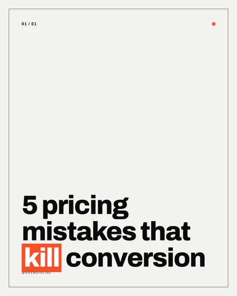
Bento is a study in restraint. The slide is nearly all off-white paper, a warm grey-white that fills the frame with generous negative space, held inside a thin hairline border that gives it the feel of a framed print or a well-set page. A slim index marker sits top-left, "01 / 01" in small tracked caps, with a single orange square echoed in the top-right corner. That orange returns as a solid highlight block behind the word "kill", the only splash of colour on the whole slide. The headline anchors the bottom-left: "5 pricing mistakes that kill conversion" set in a heavy grotesque sans, tight leading, stacked across four lines, black on white with that one word knocked out in white on orange. Underneath sits a tiny handle credit in muted grey. The whole thing reads like editorial furniture: Swiss grid discipline, the confidence of a magazine contents page, the calm of a gallery wall label. It stops the scroll precisely because it does not shout. In a feed of gradients and faces, a mostly empty white card with one hot orange word forces the eye to land where the designer wants it. The lineage is clear: International Typographic Style, the corner registration marks of print production, and the modern startup deck where a single accent colour carries the brand. Nothing is decorative. The margin is the design. The mood is authoritative and slightly premium, the look of someone who has nothing to prove and lets the words do the work. It suits a reader who trusts clean type over stock photography, and it rewards a strong headline because there is nowhere for a weak one to hide.
Best for
The orange block goes on one word, never two
The whole system rests on a single knockout highlight. In this slide it lands on "kill", the verb that carries the tension. Highlight two words and you lose the aim, the eye no longer knows where the sentence peaks. Choose the one word that would hurt most to remove, usually the verb or the number, and let everything else stay black on white. That constraint is doing the persuading. One accent, one emphasis, one place to look.
Bottom-left type needs a top-heavy empty half
Notice how the headline sits low and the top two thirds stay blank apart from the index marker and corner square. That imbalance is deliberate. The empty upper zone gives the words gravity, like text weighted at the base of a poster. If you centre the headline or fill the space with a subhead, the calm collapses and it starts to look like every other busy template. Keep the top breathing. The silence is the style working.
Wrong for anything that needs an image to sell it
Bento is all type and margin, so it dies the moment your subject is visual. A recipe, a travel destination, a product photo, a before-and-after: these need the picture, and Bento gives them nowhere to put it. This style is for ideas that live in language, listicles, hot takes, pricing and strategy points, sharp opinions. If your slide would be better with a photograph, pick a photo style. Don't force a grotesque headline to carry a visual story.