Magazine Instagram carousel style
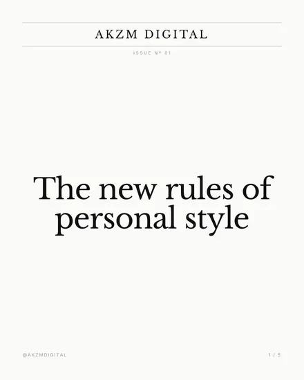
This is a print magazine cover translated to the square. The palette is almost nothing: a warm off-white paper ground, near-black type, and a single hairline rule that sits under the masthead. At the top sits a wordmark, 'AKZM DIGITAL', set in wide-tracked capitals with generous letterspacing, the way a fashion or culture title stamps its name. Directly beneath, tiny and grey, a kicker reads 'ISSUE Nº 01', complete with the superscript number abbreviation you only see in editorial settings. The headline dominates the lower-middle third, 'The new rules of personal style', set in a high-contrast serif with real bracketed serifs and thick-to-thin stroke modulation, the DNA of Didot and Bodoni that has defined masthead typography since the nineteenth century. Everything is left-hanging and calm, with vast margins of empty paper doing the work that colour and image do elsewhere. A footer carries a handle at bottom left and a page marker, '1 / 5', at bottom right, mimicking a contents or folio line. The mood is quiet authority. It reads as considered, expensive, unhurried. It stops the scroll precisely because it looks nothing like a native Instagram post: no gradient, no sticker, no bright accent, just confident restraint and the visual grammar of a printed title people trust. The lineage is unmistakably editorial, the newsstand cover and the inside feature spread, where whitespace signals budget and the serif signals heritage. Where most feeds shout, this whispers, and the whisper is the hook. The single hairline, the tracked caps, the folio marker: each is a small honest borrowing from print that tells the eye this was set by someone who knows the rules before they broke them.
Best for
The masthead carries the trust, so name it like a title
The tracked-out caps at the top, 'AKZM DIGITAL', do the heavy lifting here. They tell the reader this is a publication, not a post, and everything below inherits that authority. Give your carousel a real masthead name and set it in wide letterspacing. Treat it like the cover of a magazine you'd pay for. If you drop a plain username up top instead of a proper title, the whole editorial illusion collapses and it just looks like a note app screenshot with a serif font.
Whitespace is the budget signal, do not fill it
Look how much bare paper surrounds that headline. Two thirds of the slide is empty and that emptiness is the message: this brand can afford to say less. The instinct to add a photo, a stat, a second line, all of it fights the style. In print, generous margins read as expensive because ad-heavy pages read as cheap. Keep one masthead, one kicker, one headline, one footer. The moment you crowd the frame you lose the very quality people stopped scrolling for.
The wrong call for anything urgent or loud
This look whispers, so it's useless when you need to shout. A flash sale, a countdown, a hot take, a meme, a giveaway: all of these want energy and colour and speed, and the Didot serif with acres of whitespace will make them feel slow and aloof instead of exciting. Use it for considered, evergreen thinking where authority matters more than urgency. If the content could be a headline in a Sunday supplement, this fits. If it belongs on a shop banner, pick something with contrast and heat.