Character Instagram carousel style
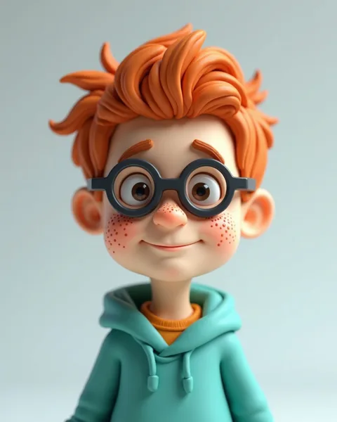
Character renders your subject as a friendly 3D cartoon figure, the kind of stylised mascot you would meet in a Pixar short or a mobile game splash screen. The example shows a young boy with a swept quiff of glossy carrot-orange hair, round black-rimmed glasses, and a soft teal drawstring hoodie over a mustard-yellow tee. Everything is modelled with rounded, toy-like volumes: a large head on a small body, oversized brown eyes, a dusting of freckles across the cheeks and nose, and a gentle closed-mouth smile. The surfaces read as smooth vinyl or matte plastic, lit evenly so the skin has a subtle sheen and the hair holds sculpted, wavy strands rather than individual hairs. The background is a flat, pale blue-grey with a soft vignette that keeps all attention on the figure. The proportions are deliberately exaggerated, big eyes, tiny torso, chunky glasses, which triggers the warmth we feel toward baby-faced designs. It stops scrolls because a character looks straight at you and smiles. There is a specific person or persona here, not a stock photo or an abstract graphic, and that face invites a parasocial connection instantly. The lineage is clear: contemporary animated-film character design crossed with collectible designer toys and app onboarding illustration. Think Funko-adjacent roundness, the clean studio lighting of a promo render, and the approachable palette of a children's brand. Because the figure is centred on empty space, there is room above or below for a caption without ever crowding the character. This is a look built for personality and mascotry, and it carries a lightness that instantly signals something is fun, human, and easy to like.
Best for
Give the character one prop that says the whole topic
In the example, the round glasses and the mustard tee do a lot of quiet work, telling you this is a bookish, gentle kid before you read a word. Lean into that. A single meaningful accessory, a headset, a paintbrush, a clipboard, tells the reader what this character represents faster than a caption. Load too many props on and the figure turns into clutter. Pick the one object that carries your theme and let the rounded, toy-like styling do the rest.
When Character undercuts the message you're selling
This look is warm and playful, which is exactly wrong for anything asking to be taken seriously. Financial advice, grief support, legal guidance, hard news: a smiling vinyl mascot makes those feel trivial or condescending. The big-eyed, freckled softness signals fun and reassurance, not authority or gravity. If your carousel needs to convey expertise, risk, or respect, reach for a photographic or editorial style instead. Character shines when the emotional register is approachable, never when the reader needs to trust you with something heavy.
Keep the head-to-body ratio exaggerated on every slide
The charm here lives in the proportions: a large head, oversized eyes, a small torso. That is what makes the figure read as endearing rather than uncanny. If you generate a run of slides, watch that the character stays consistently baby-faced across all of them. A single frame drifting toward realistic anatomy will look off, like a different render snuck in. Lock the palette too, the teal, orange and mustard, so the character feels like the same recognisable persona from slide one to slide ten.