Frost Instagram carousel style
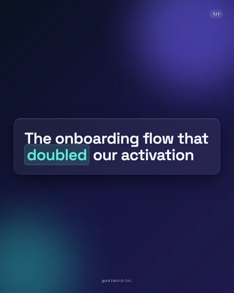
Frost sets bold white type on a deep midnight backdrop, then floats it inside a softly rounded, semi-transparent panel that reads like frosted glass. In the example, the phrase "The onboarding flow that doubled our activation" sits in a heavy sans-serif, tightly leaded, with the word "doubled" picked out in a teal-mint highlight pill that glows against the dark. The background is not flat: a violet-blue light bloom radiates from the upper right, a cooler teal glow pools in the lower left, and the whole surface has the gradient smoothness of a lock screen or a modern software splash page. The panel itself carries the classic glassmorphism cues, a faint inner border catching light, a subtle blur behind it so the gradient shows through softened. A small "1/1" pill marks the slide count top right, and a muted @AKZMDIGITAL handle anchors the base. The mood is calm, premium and unmistakably product-led. This is the visual language of Apple's frosted UI layers, iOS control centres and SaaS dashboards, the aesthetic that says software, subscription, dashboard, dark mode. It stops scrolls because it looks like a screenshot from an app you already trust, not an ad. The restraint does the work: one panel, one accent colour, one idea per slide. Nothing shouts, which in a feed full of shouting reads as authority. The type is doing almost all the communication, so every word is weighed. It evokes the quiet confidence of a well-designed settings screen, where hierarchy comes from blur and light rather than colour and clutter, and where the single highlighted word tells your eye exactly where the point lands.
Best for
The frosted panel needs the glow behind it or it's just a grey box
Glassmorphism only reads as glass when there is something coloured to blur. In the example, the violet bloom top right and teal pool bottom left give the panel something to filter, which is what sells the transparency. If you drop this type onto a flat dark background with no light source behind the panel, the frosting disappears and you are left with a plain rounded rectangle. Always seed the background with two soft light sources in different hues, then let the panel sit over the boundary between them.
One highlighted word per slide, and make it the payoff
The teal pill around "doubled" is the entire point of the slide. It is the number, the result, the reason to keep reading. Frost gives you exactly one accent colour, so spend it on the word that carries the claim, not on a connective like "the" or "our". If you highlight two or three words, the eye can't tell which one matters and the glow stops meaning anything. Write your headline so the single most important word is a metric, an outcome or a surprise.
Wrong for anything warm, human or handmade
Frost is cool, digital and corporate by design. It suits SaaS metrics and product updates. It actively fights softer subject matter. A recipe, a personal story, a small craft business or anything that wants to feel human and tactile will look cold and clinical inside this glass panel. The dark UI backdrop signals software, so if your content isn't about a screen, a system or a number, reach for a paper, linen or illustrated style instead. The medium here promises a dashboard.