Aura Instagram carousel style
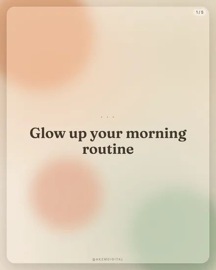
Aura builds a slide out of soft, out-of-focus colour clouds drifting across a warm cream ground. In this example you can see a peach blob top left, a terracotta and sage pairing along the bottom, and a mint wash bleeding up from the lower right corner. None of them have hard edges. They feather into each other like light through frosted glass, so the whole frame reads as glow rather than shape. Over that sits a single line of dark brown serif type, "Glow up your morning routine", centred and set large, with a discreet three-dot flourish above it. A small "1 / 5" page marker sits top right and an @akzmdigital handle anchors the foot in faint caps. The palette is deliberately low-contrast and desaturated, closer to a candle-lit interior than a screen. Nothing shouts. The mood is calm, feminine-leaning, wellness-adjacent, the visual equivalent of a slow exhale. Its lineage runs through Instagram's gradient-mesh era, the blurred blob backgrounds of skincare and meditation apps, and further back to the soft-focus airbrush aesthetic of 1970s beauty advertising. There is a touch of Rothko in the way two colour fields meet without a line between them. It stops the scroll precisely because it does not fight for attention. In a feed of sharp product shots and high-contrast text, a warm haze with one thoughtful sentence feels like a pause. The serif does a lot of work here: its bracketed, slightly old-fashioned letterforms lend the softness some authority, so the slide feels curated rather than merely pretty. Aura wants restraint. One idea per slide, generous breathing room, and a colour story that stays in the same tonal family across all five cards.
Best for
The blobs must never touch the text
Aura only works while the type sits on a clear patch of the cream ground. Look at the example: the peach and sage clouds are pushed into the corners, leaving the centre calm enough to hold the serif line without a stroke or a box behind it. The moment a blob drifts under a word, the low contrast turns to mush and the sentence stops being legible. Treat the colour clouds as framing, not fill. Keep them orbiting the edges so the middle stays a quiet stage for one thought.
Why the serif is doing the heavy lifting
Strip the brown serif out and Aura becomes wallpaper. That bracketed, book-weight face is the only firm thing in a frame full of haze, so it carries all the structure and all the credibility. A geometric sans would dissolve into the softness and read as an app splash screen. The serif pulls the look towards editorial and wellness print instead. Keep it dark, keep it large, and keep the line short, as in the example. Two lines maximum. The type is the anchor the whole soft-focus mood hangs from.
When Aura is the wrong call
This is a low-contrast, low-energy skin, and that is a liability for anything urgent or data-heavy. If your slide needs a bold number, a price, a warning, a punchy call to action, the pastel haze will swallow it and the message will feel apologetic. Aura also struggles with long copy: cram in a paragraph and the airy calm collapses. Reach for it when the content is reflective, gentle or aspirational, like routines, affirmations, self-care, quiet brand notes. For launches, promos or anything you need read across a crowded room, pick a harder-edged style.