Grad Instagram carousel style

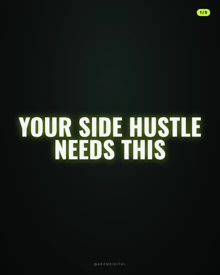
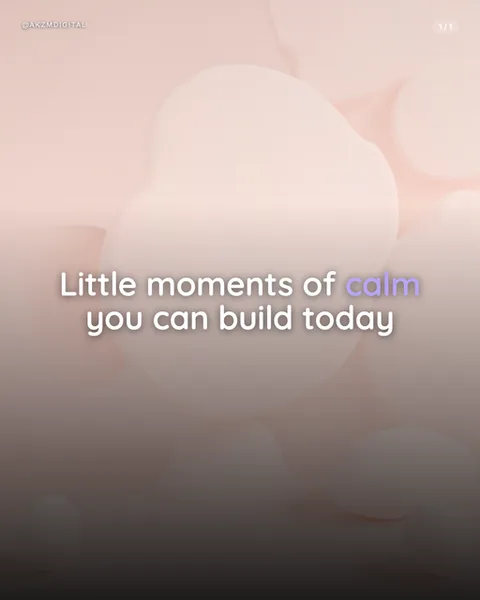
Grad builds each slide around a single glossy 3D object floating in a dark, softly graded backdrop. In this example a chunky lightning bolt hangs at a slight tilt, moulded like blown glass or wet enamel, its surface catching cyan, magenta and a hot yellow core that bleeds into orange edges. The rendering is unashamedly plump and rounded, with fat highlights running down every bevel and a mirror-soft reflection pooling beneath the shape. The background is not flat black but a graduated wash, deeper at the corners, lifting to a warm plum glow behind the object so the colour feels lit from within. Type sits low and heavy: a bold rounded sans in white, with the key figure ('6 hours') swapped to lilac so the eye lands on the number. A small '@AKZMDIGITAL' handle and a '1/1' counter keep the frame feeling like a genuine post. What stops the scroll is the contrast between candy-bright, almost edible plastic and a moody dark stage. It reads as premium and playful at once. The lineage is clear: this is the gradient mesh and chromatic glass look that spread through app onboarding screens, crypto and fintech branding, and the Behance 3D icon boom, where soft-body renders and neon rim light became shorthand for 'modern tech, but friendly'. It borrows the studio-product tradition of one hero object under controlled light, then coats it in the saturated dusk palette of synthwave. The mood is optimistic, energetic and slightly futuristic, the kind of frame that makes a productivity tip or app feature feel shiny and new rather than dry.
Best for
The bolt has to be one object, not a busy scene
Grad lives on a single hero shape rendered big. The lightning bolt works because it is instantly readable in silhouette and fills most of the frame. If you crowd the render with three or four smaller objects, the plump highlights fight each other and the dark backdrop stops doing its job. Pick one metaphor per slide, an object that stands for the whole idea, and let it float alone with room to breathe above your headline.
Recolour the number, not the whole line
Notice only '6 hours' turns lilac while the rest of the headline stays white. That single swap is the entire hierarchy trick. The reader clocks the payoff figure before they read the sentence. It only works if you restrain yourself to one coloured phrase per slide. Highlight two or three things and the emphasis collapses into noise, and the clean white-on-dark contrast that makes Grad legible on a small phone screen is gone.
Wrong for anything sombre, historical or serious
This is candy-plastic optimism. The glossy soft-body render and neon rim light say 'new app, fun tip, bright future'. Point it at grief, hard financial warnings, heritage brands or anything that needs gravitas and it reads as tone-deaf, like a toy advert gatecrashing a eulogy. Grad belongs on productivity hacks, tech launches and upbeat how-tos. If your topic needs restraint or authority, reach for a matte, textured or photographic style instead.