Aurora Instagram carousel style
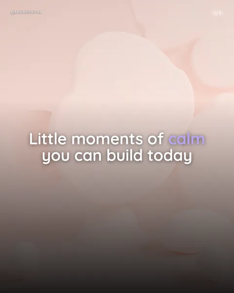
Aurora is a soft-focus dreamscape. The example slide is built from blurred, blobby forms in blush pink and cream, rounded shapes that overlap like backlit clouds or the surface of something translucent seen through frosted glass. Nothing is in sharp focus. The whole frame feels lit from behind, warm at the top where the pinks glow and cooling into a taupe, almost smoky brown toward the bottom, which gives the text room to sit without fighting the imagery. The type is the only crisp element: a rounded, friendly sans-serif in white, centred, with a single word, 'calm', picked out in a gentle lilac to break the monotone. There is a small handle in the top left and a '1/1' page marker, both kept faint so the mood stays undisturbed. The effect is calming, spa-like, gently premium. It borrows from the gradient meshes of modern wellness branding, the soft ambient renders you see on meditation apps and skincare packaging, and the diffused colour fields of abstract photography where subject dissolves into pure light. It stops the scroll not with contrast or shock but with softness, a rare quiet moment in a feed built on noise. The blurred organic shapes read as skin, petals, or bathwater without ever committing to any one thing, which lets the viewer project their own sense of ease onto them. Everything about the composition, the low contrast, the warm-to-cool fade, the single accent colour, is engineered to lower the reader's guard rather than grab their attention by force. It is a style that whispers, and in a loud feed a whisper can carry further than a shout.
Best for
Why the one lilac word does all the emotional work
The whole palette here is blush and cream, so the single lilac 'calm' is the only place your eye lands with intent. That is deliberate. When everything is soft, one gentle accent becomes the anchor. Choose that word carefully, it should be the feeling you want the reader to leave with, not just a random noun. Two accent words and the effect scatters. Keep it to one, and the softness of the rest of the frame pushes all the meaning onto that single tinted word.
When Aurora is completely the wrong call
This style is built to soothe, so it actively works against urgency. Do not use it for a launch countdown, a limited-time offer, a hot take, or anything meant to spike a reaction. The low contrast and the dissolve into brown at the base swallow bold claims. If your message needs the reader to act now, Aurora will quietly undercut it. Save this look for content where slowing down is the point, and reach for something with harder edges when you need a response.
Keep the text short or the blur betrays you
The blurred backdrop has almost no flat area to rest type on, so long paragraphs start to compete with the shifting pinks behind them. The example works because it is two short lines set dead centre in the calmer mid-band. Write in fragments, aim for six or seven words a line, and let the white space breathe. If you find yourself needing three lines of body copy, the mood is already broken. This is a headline style, not a home for explanation.