Holo Instagram carousel style
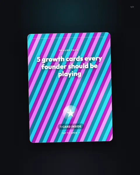
Holo turns your slide into a sealed foil pack, the kind you tear open for a trading card or a collectible sticker. The image shows a rounded card standing on a near-black background, its face covered in diagonal stripes of magenta, cyan and violet that shift like the rainbow sheen on holographic foil catching light. A dotted perforation line runs across the top, the universal cue for "peel here". The mood is playful, tactile and a little bit gacha, built entirely around the promise of what is inside. The layout is strict and it does the heavy lifting. A small uppercase kicker, "SEALED PACK", sits above the headline in tracked-out caps. The headline itself, "5 growth cards every founder should be playing", is set in a chunky rounded sans, bold and centred, white against the stripes so it stays legible over the busy pattern. Below the midpoint a glowing star medallion glints like a foil stamp, and beneath it a pill button reads "1 CARD INSIDE" with a "TAP TO OPEN" prompt and an arrow. Every element points at the act of opening. This stops scrolls because it withholds. The whole frame is a wrapper, so the eye wants the reveal. It borrows from trading card culture, Pokemon and sports packs, from mystery box unboxing videos and from the loot mechanics of mobile games, all aesthetics people already associate with anticipation. The diagonal foil stripes and the metallic star lean on the physical memory of tilting a holographic card in the light. It is loud, it is confident, and it frames plain advice as something worth unwrapping. Use it when your content genuinely counts down or reveals, and the format earns its keep.
Best for
The pack only works if slide two is the reveal
Holo is a wrapper, and a wrapper promises something inside. The perforation, the star stamp and the "TAP TO OPEN" arrow all set up a payoff. If your second slide is just more text, you have sold a mystery box full of packing peanuts. Structure the carousel as a real unpack: this cover teases the count, then each following slide delivers one card, one clean idea. Match the numbers too. If the cover says "5 growth cards", give five. Break that promise and the format resents you for it.
Why the headline must survive the stripes
Those diagonal magenta and cyan bands are gorgeous and they are also visual noise. The example keeps the headline in a heavy rounded sans, pure white, centred, because anything thinner or lower-contrast would dissolve into the foil. Do not put a serif here, and do not tint your type. Keep the line short enough to sit in three chunky rows, as "5 growth cards every founder should be playing" does. If your headline needs a fourth or fifth row, cut it. The stripes will not forgive a cramped, spindly block of copy.
When Holo is the wrong pack to open
This look screams fun, collectible, gamified. That is exactly wrong for grief, layoffs, finance you want trusted, or B2B where a buyer needs gravitas. A sealed foil pack turns a redundancy announcement into a party favour, which reads as tone-deaf. It also flops for content with no reveal structure, a single quote, a plain listicle, a data point. If you would not put your topic on a Pokemon card, do not put it in Holo. Reach for Onyx or Glass when the subject deserves quiet authority instead of a countdown.