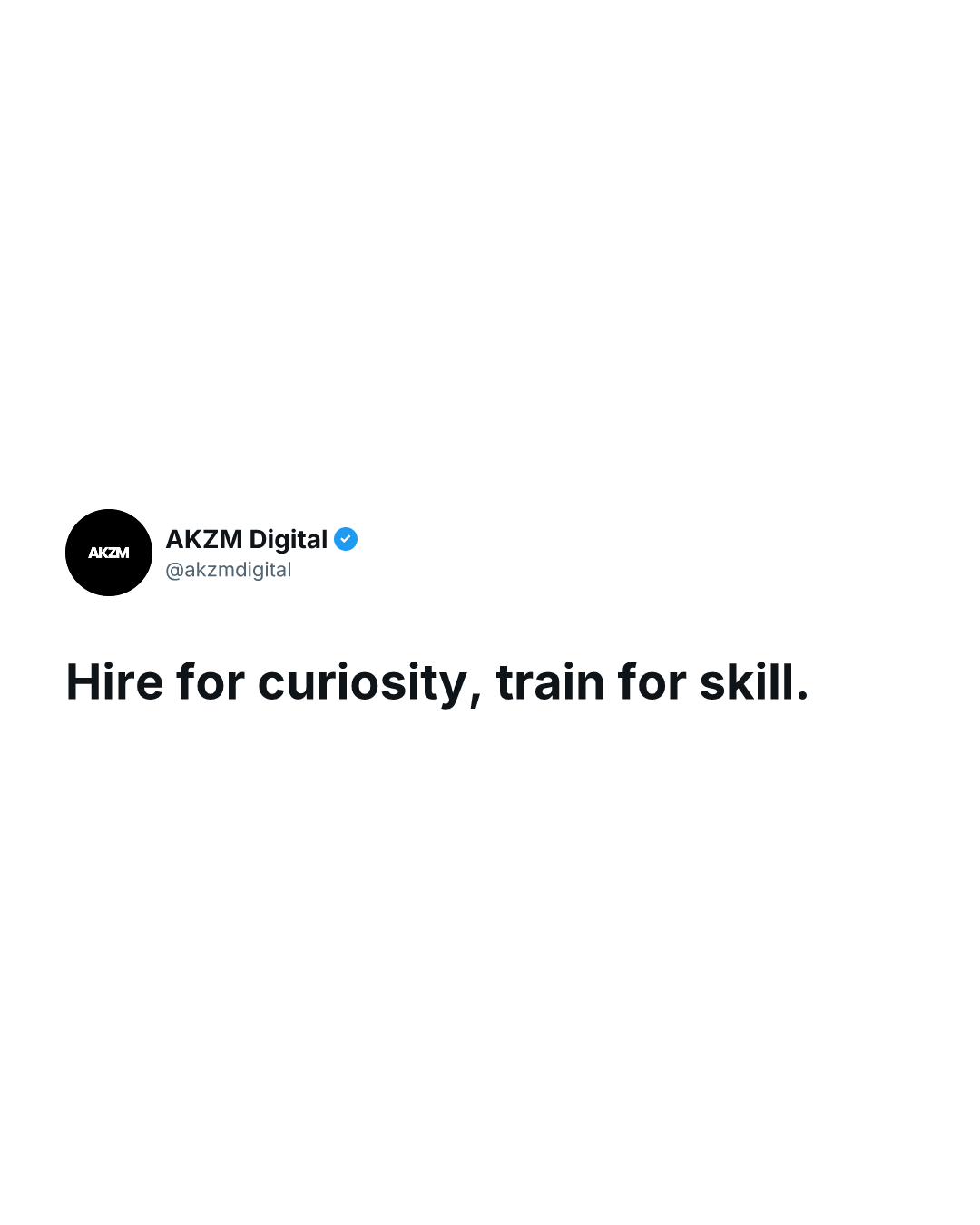
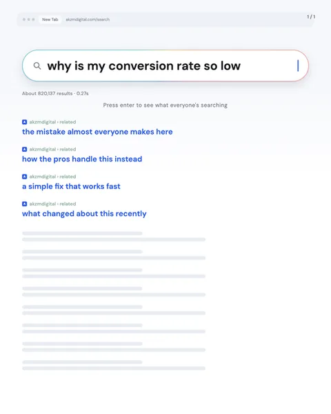
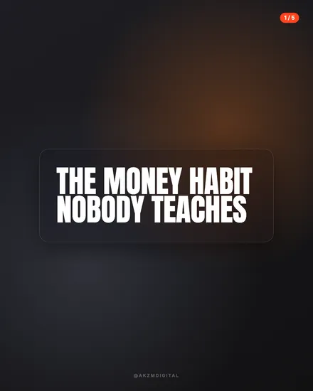
Pinged Instagram carousel style
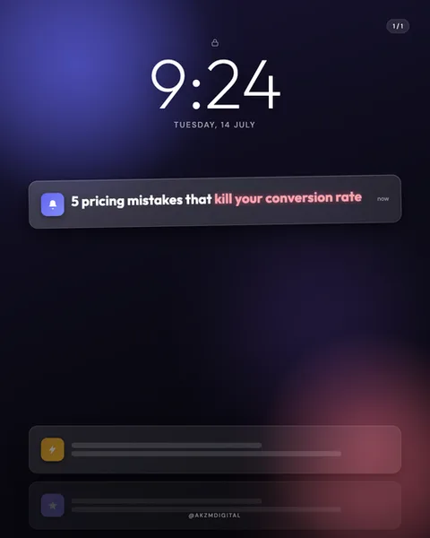
Pinged is built to look exactly like a phone lock screen the moment a notification lands. The image shows a large white clock reading 9:24 above the date TUESDAY, 14 JULY, all set in the clean system typeface Apple users see every time they glance down. The background is a deep, moody wash of navy that bleeds into blue at the top left and warms to a soft red glow lower right, the blurred gradient of a wallpaper photographed out of focus. Front and centre sits a single dark, rounded notification pill with a small rounded app icon on the left, a bell glyph, and the word 'now' tucked at the right edge. The headline lives inside that pill: '5 pricing mistakes that' in white, then 'kill your conversion rate' in a hot pink accent that does all the emotional work. At the base of the frame two more muted notification bars hint at a stacked feed, their text greyed out to keep focus up top. It stops the scroll because the eye reads it as a real alert before it reads it as an ad. That flicker of 'is this my phone?' is the whole trick. The lineage is pure iOS lock-screen UI, the same glassy, gradient-lit language Apple has pushed since the notch era, borrowed here as a native-feeling frame. Everything about it, the SF-style clock, the lozenge notification, the little app badge, signals immediacy and personal relevance rather than broadcast marketing. It is the visual grammar of a message you were meant to see, repurposed to make an audience lean in.
Best for
The pink accent word is the notification's push preview
A real push alert truncates to a line or two, so the eye hunts for the payoff word. Pinged puts that word in hot pink, here it's 'kill your conversion rate', and lets it carry the tension the rest of the sentence sets up. Colour one phrase, never two. If you highlight three things the alert stops reading as an alert and starts reading as a highlighter test. One white setup, one coloured hook, done.
Match the clock time to the feeling you want
9:24 on a Tuesday morning reads as a work-hours ping, the kind you check between tasks. That detail is doing quiet work. A late-night time changes the mood entirely, a 2:11 alert feels urgent or intrusive. Because the clock is huge and real, viewers register it. Pick a time and date that suit the topic rather than leaving a random default, and the whole frame gains a small layer of story.
Wrong for anything that needs to look considered
Pinged trades on the feeling of an interruption, so it suits punchy, curiosity-gap hooks that reward a tap. It is the wrong call for slow, premium, or reflective content. A luxury brand, a heartfelt personal essay, a detailed how-to, all of those fight the format, because a notification is by definition something quick and disposable. If your message wants to feel earned rather than urgent, reach for a cleaner editorial style instead.