Query Instagram carousel style
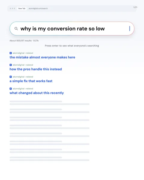
Query dresses your slide up as a search engine mid-type. The image shows a clean browser chrome at the top, a greyed tab reading "New Tab" and a faint URL, then the star of the whole layout: a pill-shaped search bar with a magnifying glass and the headline typed into it in bold black, "why is my conversion rate so low", complete with a blinking blue cursor at the end. Underneath sits the small grey results line, "About 820,137 results, 0.27s", and a centred grey prompt, "Press enter to see what everyone's searching". Below that, four autocomplete suggestions stack in blue link-blue: "the mistake almost everyone makes here", "how the pros handle this instead", "a simple fix that works fast", "what changed about this recently". The rest of the slide fades into grey skeleton-loader bars, the placeholder rectangles a page shows before content arrives. The palette is deliberately restrained: near-white background, one blue accent, black query text, soft grey for everything secondary. This is the visual language of Google, autocomplete dropdowns and loading states, so a reader's eye reads it as a live search before they read a single word. That is why it stops the scroll. It borrows the trust and familiarity of the tool everyone opens fifty times a day, then hijacks it to pose your question as if the whole internet were typing it. The lineage is pure product UI, the flat, functional Material-era web, screenshot culture, the fake-interface meme. It works because it feels found rather than made, less like an ad and more like a screenshot a friend sent you.
Best for
The query bar has to be a question your reader is already typing
Query only lands if the text in the search bar is something a real person would genuinely type at 11pm. "Why is my conversion rate so low" works because it is a confession, phrased as a search. Statements break the spell. "Our new framework for growth" is not a query, it is a headline pretending to be one. Write it as fear, doubt or curiosity in lowercase, the way people actually search when no one is watching. If you would not type it yourself, it does not belong in that bar.
The four autocomplete lines are your carousel's table of contents
Those blue suggestions, "the mistake almost everyone makes here", "a simple fix that works fast", are not decoration. They promise the next four slides. Treat them as a genuine outline: each one should map to a real payoff you deliver later. Keep them short, keep them lowercase to match autocomplete, and make them feel like competing paths rather than a numbered list. The reader picks one in their head, which is exactly the small commitment that pulls them into slide two.
When your topic isn't something anyone searches, skip Query
This format leans entirely on the fiction that people type your subject into a search bar. That fiction collapses for announcements, personal stories, brand launches or anything celebratory. Nobody googles your funding round or your birthday. Query is built for problems, doubts and how-tos, the stuff with real search volume behind it. If your content is a proclamation rather than a question, the empty results count and blinking cursor start to feel like a costume with no one inside. Reach for a poster or magazine style instead.