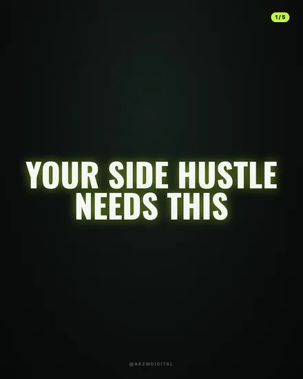
Thumbnail Instagram single post style
Thumbnail makes one image, not a carousel: a single hero and a headline built to win one glance in the feed. Choose Single post when you start a brief to use it.
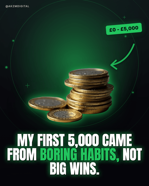
Thumbnail is built to look like a top-performing YouTube thumbnail: one image, not a carousel. The example slide shows a dark near-black background bleeding into a deep emerald glow, a single hero object shot in sharp studio focus, a stack of pound coins with a couple tipped over in the foreground, and a soft green halo ring drawn behind it to frame the subject. On top sits a fat, condensed sans-serif headline in all caps, "MY FIRST 5,000 CAME FROM BORING HABITS, NOT BIG WINS," with the key phrase "BORING HABITS" flipped to bright green so your eye lands on it first. There is a hand-drawn curved arrow pointing from a rounded green label, "£0 - £5,000," straight at the coins, plus scattered plus signs and dots as filler sparkle. Everything about it is loud, high-contrast and legible at a thumbnail's size, which is exactly the point. This is the visual language of MrBeast-era creator thumbnails and click-through optimisation: one clear subject, one glowing accent colour, one blunt promise, an arrow telling you where to look. It borrows from sports-broadcast lower thirds and hype-reel finance content, the kind that lives on money, self-improvement and hustle channels. It stops the scroll because it reads like content that has already been engineered to win a click. Nothing is subtle. The green rim light, the thick outlined type, the annotation arrow and the price-range sticker all shout "watch this." The mood is confident, slightly aggressive, unmistakably online. If your topic thrives on a clear before-and-after or a single striking number, this style hands you a frame that has been proving itself on the platform for years.
Best for
Why the arrow and the price label do half the selling
Look at the example: the '£0 - £5,000' sticker and the curved arrow aren't decoration, they carry the claim before you even read the headline. The eye follows the arrow to the coins, clocks the number, then drops to the type. Use that pipeline. Put your concrete figure or promise in the label, point the arrow at the object that proves it, and let the headline land the emotional hook. Skip the label and you lose the thing that makes a thumbnail a thumbnail: a specific, quantified reason to stop.
One green word, or the highlight trick stops working
The headline flips only 'BORING HABITS' to green while everything else stays white. That single accent is doing the work of directing the read. The moment you highlight three or four phrases, nothing is emphasised and the slide looks messy rather than engineered. Pick the two or three words that are the actual surprise or payoff, colour just those, and leave the rest in plain white. The contrast against the dark background is what makes the green glow, so protect it by using it sparingly.
When Thumbnail is the wrong call
This style screams a promise, so it needs a topic that can back one up. It's brilliant for money, fitness, results and how-I-did-it stories. It's actively wrong for anything reflective, sombre, luxury or nuanced. A grief piece, a high-end brand, a subtle think-piece or a slow, quiet narrative will feel cheapened by the arrows, glow and all-caps hype. If your content's value is in restraint or credibility through calm, reach for Onyx or Cinematic instead. Thumbnail rewards boldness and punishes subtlety.