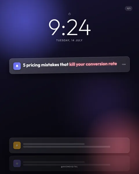
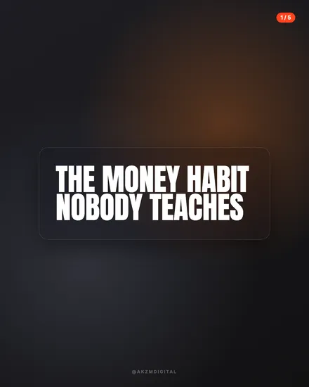
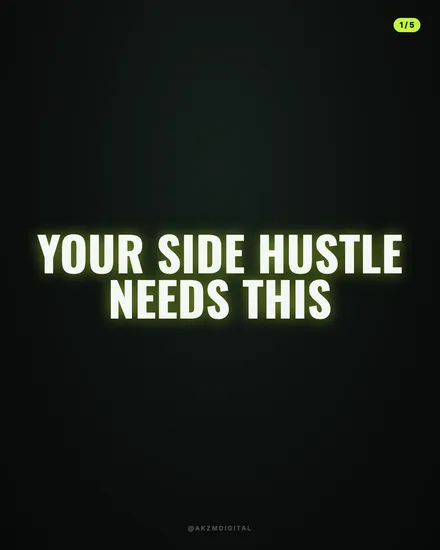
Track Instagram carousel style
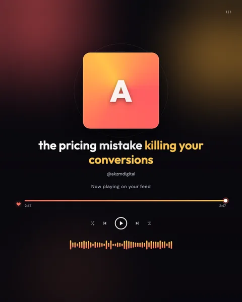
Track dresses your slide as a music player, and it commits to the disguise completely. The frame is a deep, near-black gradient that warms into rust and amber at the edges, the kind of ambient glow a phone gives off when the album art bleeds into the background. At the centre sits a large rounded album tile, here a coral-to-orange gradient with a single serif 'A' pressed into it, standing in for cover art. Below runs the whole apparatus of playback: a bold white track title with a hot-yellow highlight on the key phrase, a small greyed handle '@akzmdigital' where the artist name would go, and a 'Now playing on your feed' subtitle that winks at the format. Then the working furniture of a player, a red progress bar with a matching heart, twin 2:47 timestamps, shuffle, skip, a ringed play button, and repeat icons, and finally a warm orange audio waveform pulsing across the bottom. The type is chunky and rounded, sitting comfortably against the dark. It stops the scroll because the brain reads 'music app' before it reads 'advert', and by then you are already inside the frame. The lineage is Spotify and Apple Music now-playing screens, the lock-screen media widget, that whole streaming-era visual grammar we all glance at a hundred times a day. Track borrows that familiarity and that sense of something already in motion. The waveform and the ticking timestamp imply the content is playing right now, which is a quietly clever trick for holding attention. It is a format skin with a strong point of view, warm rather than clinical, and it works hardest when your line reads like a track title.
Best for
Your headline has to scan like a song title
The player only convinces if the text where a track name goes actually sounds like one. 'the pricing mistake killing your conversions' works because it is a punchy fragment, not a sentence. Long explanatory copy breaks the illusion instantly, because nobody names a song with a full clause. Write in the rhythm of a title: short, front-loaded, one idea. Use the yellow highlight on the two or three words that carry the hook, exactly as this slide picks out 'killing your conversions'.
The waveform and timestamps are doing the persuasion, so leave them
That orange waveform and the two 2:47 markers are not decoration, they signal something is playing now. It is the same reflex that makes you glance at a track already halfway through. Resist the urge to swap them for real data or a call to action. Their job is to feel authentic and in motion, and the moment they read as fake, the whole player collapses into a graphic. Keep the transport controls intact too, a player missing its buttons looks broken, not stylised.
Skip Track for anything that needs to feel authoritative or printed
This look is warm, casual and screen-native. That is perfect for a hot take or a quick lesson, and wrong for a whitepaper, a legal point or a luxury product. A now-playing widget implies something light and disposable, the kind of thing you thumb past between songs. If your topic needs weight, permanence or the credibility of print, reach for Gazette or Magazine instead. Track earns attention by feeling familiar and low-stakes, so do not hand it a subject that needs gravity.