Botanica Instagram carousel style
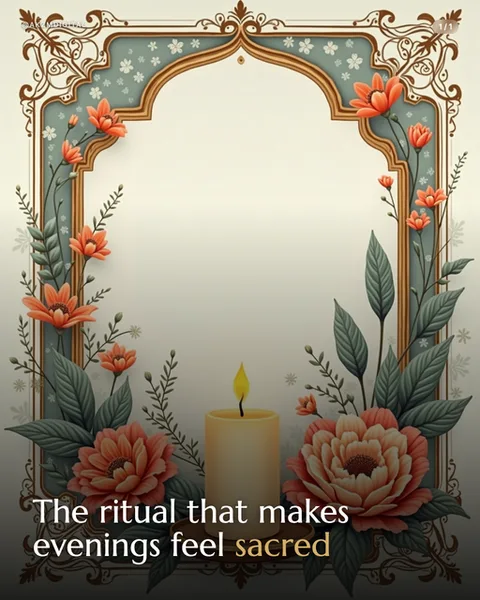
Botanica frames every slide inside an ornate illustrated arch, part Art Nouveau, part illuminated manuscript. In this example a sage green and terracotta border rises into a pointed Mughal-style arch, crowned with scrolling gold filigree and scattered white blossoms. Coral poppies and pale peonies climb the sides on painted stems, their leaves rendered in soft matte greens with visible brushwork. At the base a single lit candle sits between two full blooms, its yellow flame the warmest point in the frame. The centre is left as a calm cream gradient, almost parchment, so the eye rests before the eye reaches the copy. Type sits low: a clean serif reading 'The ritual that makes evenings feel sacred', with 'sacred' picked out in gold to echo the border metalwork. The mood is devotional and unhurried, closer to a hymnal endpaper or a botanical apothecary label than to anything digital. What stops the scroll is the density of hand-painted ornament against the empty middle, a composition that feels precious and slow in a feed built for speed. The lineage is clear: William Morris textiles, Alphonse Mucha panels, the decorated borders of old prayer books and seed catalogues. Every element is symmetrical and framed, which signals care and ceremony. The palette stays muted and dusty rather than saturated, so it reads as heritage rather than kitsch. This is a style that promises the reader something tended by hand, a small ritual worth pausing for, and the illustration does the emotional work before a single word is read. It suits topics that want to feel sacred, seasonal, or quietly luxurious without shouting.
Best for
The empty centre is the whole design, don't fill it
Botanica works because the ornate border pushes inward and leaves a calm parchment core. That negative space is where the reader breathes and where your one line of copy lands. The temptation is to add a subheading, an icon, a second sentence. Resist it. Every extra element you drop into the middle turns the frame from a shrine into a cluttered greetings card. One title, maybe one gold-accented word, and nothing else in that space.
Why gold on one word does more than colour on ten
Notice 'sacred' is the only word in gold, echoing the filigree at the top of the arch. That single accent ties the type to the illustration and tells the eye which idea to keep. If you gild half the sentence the trick collapses and the border stops feeling special. Choose the one word that carries the emotional weight of the slide, the promise or the payoff, and let it borrow the metalwork. Everything else stays in quiet ink.
When Botanica is the wrong frame entirely
This style whispers ceremony, heritage and slowness. That makes it wrong for urgency, data, hot takes or anything that needs to feel current and fast. A productivity hack, a market crash, a bold contrarian argument all fight the dusty devotional mood and end up looking mismatched. Botanica belongs to rituals, seasons, self-care, faith, weddings, teas and candles. If your topic would never appear on a prayer-book endpaper or a seed catalogue, pick a plainer style and save this one.