Vellum Instagram carousel style
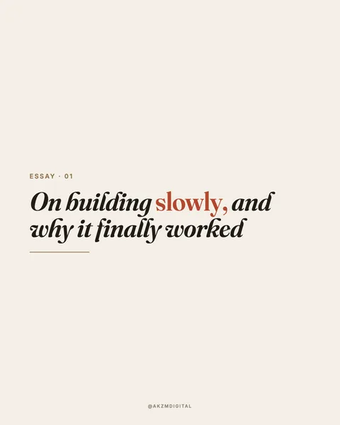
Vellum is a warm, paper-toned typographic style built around a single high-contrast serif and a lot of restraint. The background here is a soft off-white, closer to unbleached cream than sheet white, which reads like the flyleaf of a well-made book. The headline runs in an italic serif with dramatic thick-to-thin strokes and elegant swash tails on the 'y' and 'g', set in near-black. One word, 'slowly', is picked out in a muted terracotta red, the only colour on the slide, which pulls the eye straight to the emotional heart of the sentence. Above the headline sits a tiny letterspaced label, 'ESSAY · 01', in small caps, and a short horizontal rule under the type acts as a full stop for the composition. Everything is left-aligned and floated in the lower-middle of the frame, leaving generous negative space above. A faint '@AKZMDIGITAL' credit sits centred at the very bottom. The mood is literary, considered, quietly confident. It stops the scroll precisely because it does not shout: in a feed of saturated photos and bold sans-serif, a page that behaves like the opening spread of a printed essay signals that there are actual words worth reading here. The lineage is clear. This borrows from editorial book design, the didone serifs of fashion mastheads, and the understated colophon pages of independent print magazines. The single accent colour is a magazine pull-quote trick. The small-caps kicker and hairline rule come straight from typeset chapter openers. Vellum is text-first by design, so it lives or dies on the sentence you choose to set. There is no illustration to hide behind, only type, space, and one deliberate flash of red.
Best for
The one terracotta word is the whole design decision
Vellum gives you exactly one accent colour and expects you to spend it wisely. In the example, 'slowly' carries the meaning of the entire line, so it earns the red. Colour the wrong word and the emphasis fights the sentence. Pick the verb or the surprising noun, never the connective tissue. And never colour two words in the same headline. The moment a second word turns red, the trick collapses and the page looks like a mistake rather than a choice.
Write the sentence like the first line of an essay, not a caption
The 'ESSAY · 01' kicker sets a promise: this is longform thinking, compressed. Headlines that suit Vellum have a clause and a turn, like 'On building slowly, and why it finally worked'. Punchy three-word hooks feel starved on this much cream paper. Give the serif something to breathe through, a full thought with a comma in it. The italic swashes were drawn for flowing lines, so short shouty fragments waste the typeface's best feature entirely.
Skip Vellum when the story is visual or the mood is loud
This style has no image, no texture, no energy beyond type. If your carousel is about a product shot, a before-and-after, a place, or anything you'd rather show than tell, Vellum starves it. It also reads as calm and bookish, which is wrong for hype launches, sales, or anything urgent. Use it for reflective, opinion-led, personal essay content. For a flash sale or a bold announcement, reach for something with contrast and colour instead.