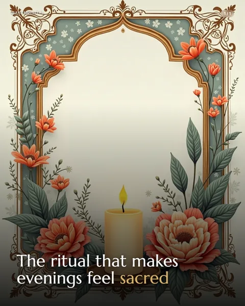
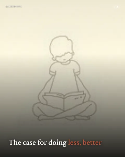
Watercolour Instagram carousel style
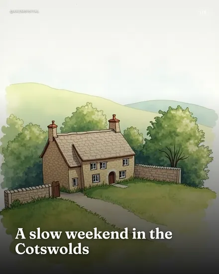
This is a soft, hand-painted watercolour scene: a honey-stone cottage with two chimneys and a slate roof, tucked between rounded green trees and a hazy hillside that fades to pale grey at the top. The palette is muted and natural, sage greens, warm sandstone ochres, dusty olive shadows, with the sky left almost bare so the paper breathes. You can see the medium doing its work, gentle wet-on-wet bleeds in the distant hills, dry-brush texture on the foliage, and a loose lawn washed in with visible brush movement rather than crisp edges. Nothing is hard-lined. The dry-stone wall and garden path are suggested with a few confident strokes, not laboured detail. Type sits bottom-left in a bold serif, 'A slow weekend in the Cotswolds', dark ink against the lightest part of the wash so it reads cleanly without a box or bar. The mood is calm, nostalgic, unhurried, the visual equivalent of a slow exhale. It stops the scroll precisely because it is quiet. In a feed of saturated photos and hard graphic templates, a gentle painted landscape reads as handmade and human, and the eye rests on it. The lineage is classic English watercolour illustration, the tradition of countryside travel books, National Trust postcards, and children's picture-book landscapes. It carries the association of craft, patience and place. Because the artwork is rendered per slide, every scene keeps that same washy, paper-textured consistency across a whole carousel, so a series of cottages, lanes and gardens feels like pages torn from one sketchbook rather than stock images bolted together. It is warmth first, information second.
Best for
Leave the sky empty so the wash can breathe
Look at the top of this slide, it fades to almost bare paper. That negative space is not laziness, it is what makes watercolour read as watercolour. If you fill every corner with detail and colour, you lose the airy, unfinished quality that signals a hand and a brush. When you brief scenes for this style, ask for a clear light area, usually the sky, both to hold the mood and to give your headline somewhere clean to sit without a background bar.
This look sells the place, not the product
The whole frame here is atmosphere: a cottage, trees, a hazy hill, and the promise of a slow weekend. Watercolour is superb for evoking a location, a season or a feeling, and hopeless at showing a spec sheet or a screenshot. If your carousel needs to display a discount, a data point or a UI, this softness works against you. Reach for it when the subject is somewhere to go or a mood to settle into, not something to click and buy right now.
Match the type to the tradition, keep it inked and quiet
The serif reading 'A slow weekend in the Cotswolds' works because it echoes the old travel-book captions this medium comes from. It is dark, confident and sits flat on the lightest patch of wash. Avoid neon, heavy sans slabs or drop shadows, they snap you out of the handmade world instantly. Keep text to a short, unhurried phrase. A long block of copy fights the loose brushwork and makes the painting feel like a stock backdrop rather than the point of the slide.