Compile Instagram carousel style
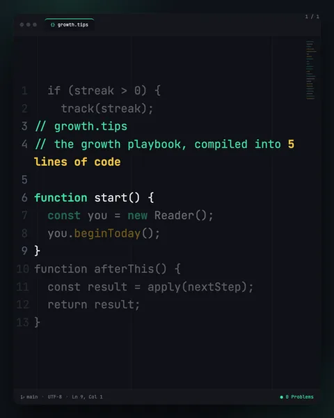
Compile renders your message as an open code editor. The image shows a near-black window, the deep charcoal of a dark IDE theme, with a title bar carrying three traffic-light dots and a "growth.tips" tab in a curly-brace icon. Down the left edge runs a grey line-number gutter, 1 to 13, and a tiny minimap sketch sits top right. The type is a monospaced font, and it behaves like real code: green comment lines carry the actual message ("the growth playbook, compiled into 5 lines of code"), while the surrounding lines are working JavaScript, function start(), const you = new Reader(), you.beginToday(). Syntax highlighting does the colour work for you, keywords in one hue, strings and numbers in yellow, function names in a soft green, everything else muted. A status bar sits at the foot: "main", "UTF-8", "Ln 9, Col 1", "0 Problems". It stops scrolls because it reads as something not meant for you. A carousel is marketing; a code editor is a workspace. The eye clocks the gutter, the tab, the traffic lights and assumes it is looking at a screenshot from someone's actual screen, so it slows down to read. The lineage is plain: VS Code and the dark-theme developer aesthetic that has spread far beyond programmers into productivity culture and build-in-public Twitter. The clever move is that the message hides inside comments, the parts of code the machine ignores but the human reads, so the metaphor holds together instead of being decoration bolted onto the top.
Best for
Put the message in the comments, the logic in the code
Look at the image. The green comment lines carry the real point, and the black-on-charcoal function bodies are plausible working code around it. That split is the whole trick. Comments are the part a compiler skips but a person reads, so it feels natural that the human message lives there. If you dump your marketing copy into the function names instead, it reads as fake code and the spell breaks. Write your line as a comment, then wrap it in the simplest believable logic you can, a function called start(), a return, nothing that needs to actually run.
Thirteen lines is the ceiling, not a target
The gutter in the image stops at 13 and the slide already feels full. A code editor has no room to breathe the way a poster does; every extra line pushes the syntax highlighting into noise. Keep to one comment block of two or three lines and one short function beneath it. If your idea needs five bullet points, this is the wrong format, because a fifteen-line function on a phone screen becomes grey mush nobody parses. Treat the line count as a hard limit that forces you to say one thing.
When Compile is the wrong call
This style speaks to people who recognise an IDE on sight, developers, indie hackers, build-in-public founders. To everyone else the traffic lights and the const keyword read as intimidating or irrelevant, and a beauty brand or a wellness coach borrowing this look just seems to be wearing someone else's uniform. If your audience has never opened a code editor, the format works against you. Use it when the developer signal is a feature, not when you are only chasing novelty. The aesthetic carries a strong tribe with it, and that tribe is narrow.