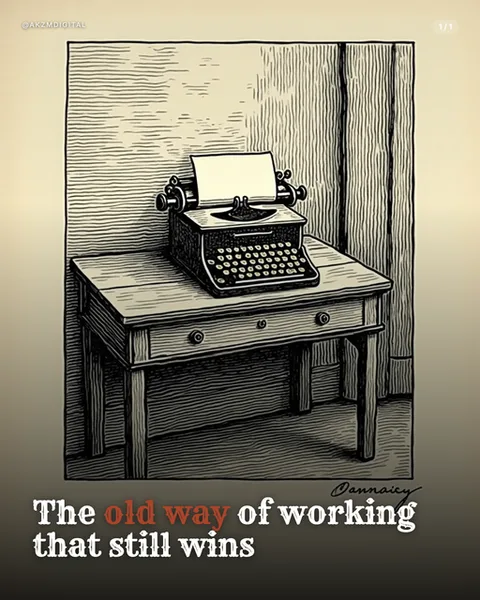
Cutout Instagram carousel style
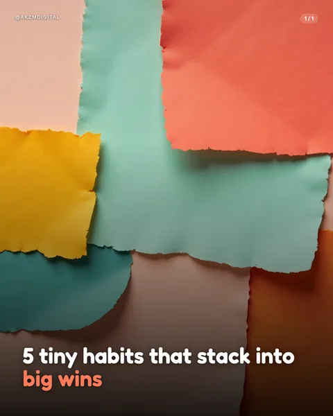
Cutout builds each slide from overlapping rectangles of torn paper, arranged like a loose grid that never quite lines up. In this example you can see the actual fibres along every ragged edge, the pale peach panel top left, the coral block, a wide band of sage green cutting across the middle, mustard yellow on the left, and a lower run of teal, warm brown and terracotta. Nothing is glossy. The palette is muted and earthy, sun-faded rather than saturated, the sort of colours you get from construction paper left in a drawer for a decade. Soft shadows sit under each torn strip, giving genuine depth so the layers feel physically stacked on top of one another. The mood is tactile, handmade and calm, warm without being twee. Type is set in a rounded, chunky bold sans, left aligned across the bottom, with the key phrase 'big wins' picked out in the coral tone pulled straight from the paper above it. That colour echo is deliberate, tying the words into the collage rather than floating them on top. The style stops scrolls because it looks made by hands, not rendered by a template, in a feed dominated by flat vectors and stock photos. Its lineage runs through mid-century paper collage, Matisse cut-outs and the analogue craft of scrapbooking and children's picture books, with a nod to the torn-edge aesthetic of indie zines. The overlapping planes owe something to Bauhaus colour composition too, geometry softened by rough edges. It reads as considered and warm, the visual equivalent of a slower, kinder voice, which is exactly why it suits gentle advice and reflective content rather than urgent hard sells.
Best for
Pull your accent colour straight off the paper
See how 'big wins' is set in the same coral as the block above the type. That is the whole trick. Cutout gives you a ready-made palette in every slide, so your accent word should borrow one of those exact tones rather than introduce a new brand colour. A stray blue or purple would sit outside the collage and look pasted on. Sample from the paper and the words become part of the composition, not a caption stuck over it.
The torn edges need room to breathe
This style lives or dies on those ragged fibres. If you crowd the frame with too many small strips, the edges stop reading as torn paper and start looking like noise. Keep to five or six large planes per slide, the way this one does, and leave each block big enough that the eye registers the rip. Overlap them by an inch or two so the soft drop shadows can do their job. Fewer, bigger pieces always beats many fussy ones.
Wrong for anything that needs to feel precise
Cutout signals warmth, craft and slowness. That makes it lovely for habits, wellbeing and gentle encouragement, and quietly wrong for data, finance, tech specs or anything urgent. A torn-paper slide selling quarterly revenue figures reads as flippant, because the handmade texture undercuts the authority the numbers need. If your message is 'trust these figures' or 'act now', reach for a cleaner, sharper style. Save Cutout for when the tone itself is soft.