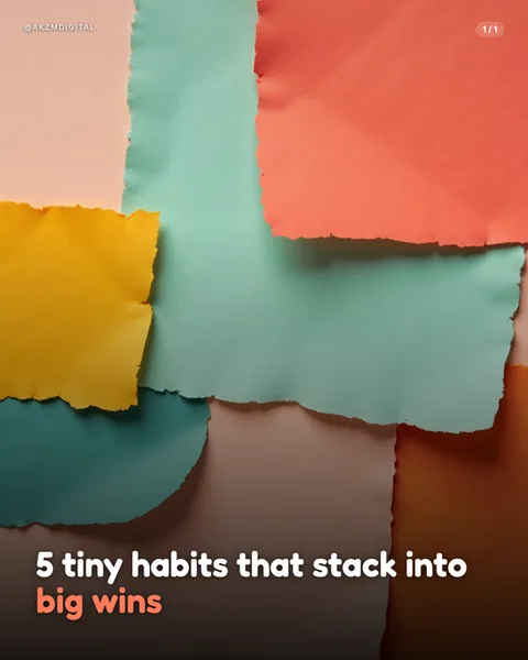
Paper Collage Instagram carousel style
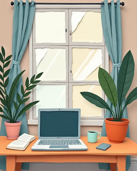
Paper Collage builds a scene the way a child's cut-and-paste picture does, from flat shapes laid one over another with soft, hand-torn edges. In this example a home workspace sits below a window, and every element reads as a separate piece of coloured paper: the dusty teal curtains, the terracotta and pink plant pots, the orange desk, the slate-grey laptop, the little mint mug. Notice the torn paper texture on the window panes, those ragged white and cream fragments that make the glass look assembled rather than drawn. The palette is muted and warm, sage green leaves against a soft peach wall, nothing shouting for attention yet nothing dull either. Layers are stacked with a faint sense of depth: the two large houseplants overlap the desk and window, the curtains sit behind them, the wall sits behind everything. Lines are simple and rounded, shadows are minimal and matte, there is no gloss and no photographic detail anywhere. The mood is calm, tidy, domestic, the sort of quiet corner you would actually want to work in. It stops a scroll because it looks handmade in a feed full of stock photography and glassy 3D renders, and handmade reads as honest and human. The lineage is clear: mid-century cut-paper illustration in the spirit of Eric Carle and Ezra Jack Keats, the construction-paper craft table, and the flat matte textures of contemporary editorial illustration. Because every shape is paper, colour blocking does the composing rather than perspective or light, which keeps slides legible at thumbnail size and gives a whole carousel a consistent, gentle warmth from first slide to last.
Best for
Why the torn edge has to stay torn, never cleaned up
The whole charm of this look lives in the ragged white fringe you can see on the window panes here, where the paper has been ripped rather than cut. That imperfection is what tells the eye a human hand assembled the scene. If your slides start smoothing those edges into crisp vector shapes, you lose the collage entirely and land in flat illustration, which is a different, colder style. When you prompt or brief, ask specifically for torn paper texture and visible layering. Let the seams show. The mess is the message here.
Colour blocks carry the meaning, so pick three papers and stop
Look at how this scene is composed: teal curtains, peach wall, orange desk, and green foliage do all the work. There is no lighting trick, no gradient, no depth of field. In a paper collage, flat colour areas are your only compositional tool, so a tight palette keeps slides readable. When every slide in a carousel draws from the same three or four papers, the set feels like one continuous craft project rather than a random gallery. Add a fifth and sixth colour and the calm falls apart into noise.
When Collage is the wrong call: data, urgency, and luxury
This style whispers domestic and gentle, which is lovely for a slow subject and wrong for a fast one. Do not reach for paper collage when you need a hard-hitting stat, a countdown, a price drop, or anything that trades on urgency. The soft torn edges undercut the tension. It also reads as friendly and affordable, so it fights a premium or luxury positioning where you want polish and restraint. If your message is 'act now' or 'this is expensive and exquisite', pick a cleaner, sharper look and keep Collage for the warm explainer.