Risograph Instagram carousel style
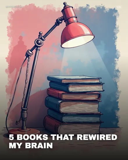
This Risograph slide reads like a two-colour print pulled off an old duplicator, where a hot coral-red and a slate-blue soak into each other in blotchy, uneven washes rather than clean gradients. Look at the background: the red bleeds down from the top left and pools around the lamp, the blue collects in the lower right, and where they overlap you get muddy violet patches that no digital gradient would ever make on purpose. That misregistration is the whole point. The edges of the frame carry a grainy, speckled halo, the signature of ink laid down through a screen. The scene itself is simple and warm: an angled desk lamp throwing a bright cone of light onto a stack of well-worn books, spines striped in the same limited palette. There is texture everywhere, on the book covers, the lamp arm, the wooden desk, all rendered with that slightly chalky, tactile grain riso is loved for. The type is a chunky white slab sans, all caps, sitting low and heavy: 5 BOOKS THAT REWIRED MY BRAIN. It stops the scroll because it looks handmade in a feed of flat, over-polished graphics. The limited palette forces the eye to the lit subject, and the print flaws read as honesty. Its lineage is clear: mid-century risograph and mimeograph printing, zine culture, indie poster art, the kind of two-tone spot-colour work you see on gig flyers and small-press book covers. It borrows the warmth of print without pretending to be a photograph. The mood is cosy, bookish, a little nostalgic, the visual equivalent of a good independent bookshop.
Best for
The off-register bleed is a feature, do not clean it up
The muddy violet where red meets blue, the halo of speckle around the frame, the slightly misaligned edges: these are what make riso read as print rather than a flat vector. If you smooth them out chasing a crisp look, you lose the entire association. When you brief a slide, keep the wash uneven and let the two inks overlap. A perfectly clean riso is just a duotone, and duotones do not carry the same handmade warmth this style trades on.
Two inks means two inks, resist the fourth colour
Every element here lives inside a coral-and-slate palette, even the book spines and the wooden desk. Riso presses lay down one spot colour at a time, so a genuine look uses two, maybe three plates at most. The moment you add a bright green or a yellow to make a chart pop, the illusion breaks and it looks like a filter, not a print. Plan your carousel so the same two inks carry all five slides. The constraint is what makes the set feel like a coherent zine.
Wrong for data, right for a mood
This look drowns detail. Fine text, dense charts, screenshots and step-by-step diagrams all fall apart in the grain and the low-contrast wash. If your carousel is a pricing breakdown or a technical how-to, pick something cleaner. Riso earns its keep on reflective, bookish, personal content, the reading list, the year in review, the quiet essay. Notice how little information this slide carries: a lamp, some books, one line of type. That restraint is the format working as intended, not a limitation to fight.