Gazette Instagram carousel style
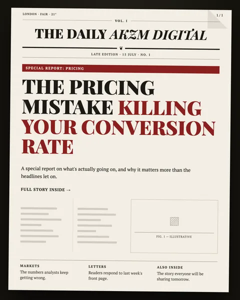
Gazette turns your topic into the front page of a broadsheet newspaper. The example slide is set on warm off-white newsprint stock, hemmed by a thick black border with a subtly folded corner top right, so it reads like a physical paper you could pick up. The masthead, "THE DAILY AKZM DIGITAL", runs in a high-contrast serif with an italic middle word, ruled off above and below by hairlines and flanked by the small furniture of real papers: a dateline reading "LONDON · FAIR · 21°", "VOL. I", a "1/1" folio, and a "LATE EDITION · 15 JULY · NO. 1" strapline. Beneath a deep red "SPECIAL REPORT: PRICING" banner, the headline stacks in a heavy condensed serif, with the words "KILLING YOUR CONVERSION" thrown into the same red for emphasis. A grey standfirst, a "FULL STORY INSIDE →" kicker, and a lower deck of dummy body columns, a boxed "FIG. 1 — ILLUSTRATIVE" placeholder, and three footer sections ("MARKETS", "LETTERS", "ALSO INSIDE") complete the illusion. It stops scrolls because the eye reads "newspaper" instantly and grants it the authority of print: a headline in a feed masquerading as reported fact. The lineage is clear, mid-century broadsheet typography, hot-metal Times and Century-style serifs, the two-colour red-and-black front pages of the old financial and society papers. The mood is credible, editorial, slightly urgent, the visual grammar of the front page above the fold where the day's biggest story lives. Nothing here is glossy or digital. It trades entirely on the trust we still lend to ink on paper.
Best for
Red is a highlighter, not a paint bucket
The layout gives you exactly two inks, black and that deep newspaper red, and the red is doing precise work: it colours only "KILLING YOUR CONVERSION" and the "SPECIAL REPORT" banner. That restraint is the whole trick. Colour the entire headline red and you lose the jolt, because there is no black to jolt against. Pick the three or four words that carry the argument and redden only those. The reader's eye lands on them first, reads them as the verdict, then fills in the rest. Treat red as the thing you underline by hand, never the body of the story.
The masthead furniture is what sells the forgery
What makes this read as a real paper is not the big serif, it is the small stuff around it: the dateline with a temperature, "VOL. I", the "NO. 1" edition line, the "1/1" folio, the "FIG. 1 — ILLUSTRATIVE" caption. Skip those and you have a poster in a serif font. Fill them in with plausible, specific detail and the brain files the whole thing under "newspaper" before it reads a word. Give your masthead a name that suits your topic, and keep the strapline dates and edition numbers consistent slide to slide.
Wrong for anything that wants to feel friendly or new
Gazette borrows the authority of print, which means it also borrows print's baggage: establishment, seriousness, yesterday's news. It is superb for exposés, hot takes, industry analysis and "here is what's really going on" reports. It is the wrong call for a playful product launch, a soft lifestyle brand, or anything that trades on being fresh and human. The newsprint texture and funeral-black masthead will make a birthday promo or a wellness post feel like an obituary. If your topic wants warmth or novelty, pick a cleaner, brighter format.