Notebook Instagram carousel style
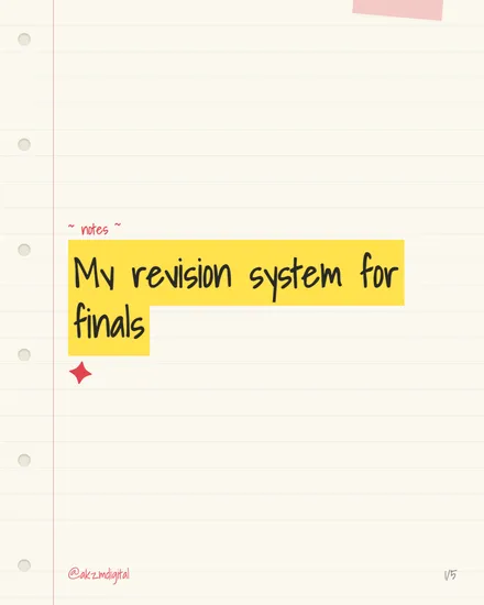
Notebook takes the most familiar surface in anyone's education: a sheet of lined refill paper. The background is a warm off-white, faintly cream rather than stark white, with pale horizontal rules and a single red margin line running down the left edge. Six punched holes sit along that margin, drawn softly so they read as paper rather than as icons. In the top right corner a small square of pink washi tape sits at a slight angle, as if the page were stuck into a bullet journal. The headline, 'My revision system for finals', is set in a chunky handwritten marker font and slashed through with a bright yellow highlighter block, the ragged left and right edges of the swipe left deliberately imperfect. Above it a smaller cursive label reads '~ notes ~', and a hand-drawn red four-point sparkle sits under the text as a doodle accent. The handle '@akz.mdigital' and a '1/5' page marker anchor the bottom in the same red as the margin. The mood is studious, personal and a little nostalgic, the exact feeling of borrowing a diligent friend's notes. It stops the scroll because it looks handmade and un-corporate in a feed of polished graphics, and it signals 'useful information, honestly shared' before a single word is read. The visual lineage is clear: school exercise books, Filofax and bullet-journal culture, and the studygram community that turned neat revision spreads into an aesthetic. The highlighter swipe borrows directly from how students actually mark a textbook, so the design mimics the act of studying itself rather than merely illustrating it.
Best for
The highlighter swipe should land on the phrase you'd actually revise
That yellow block is not decoration, it is emphasis borrowed from real note-taking. When someone highlights a line in a textbook, they are marking what matters. So put the swipe under the words a reader would want to remember, not under a filler connective. On this slide it sits under the whole title because the title is the takeaway. If your headline is long, highlight the four or five words that carry the meaning and let the rest sit plain.
Why the doodles have to stay sparse to read as handwritten
One washi tape corner, one red sparkle, one cursive '~ notes ~' label. That restraint is what makes the page feel like a real spread rather than a scrapbook. The moment you add three stickers, two arrows and a flower border, the eye stops trusting it as genuine handwriting and starts seeing a busy template. Pick one accent per slide, vary which one, and let the lined paper carry the rest. Empty space here reads as calm, not as a gap to fill.
Wrong for anything that needs to look authoritative or premium
Notebook says 'a person figured this out and is sharing it'. That is perfect for study tips, habit systems and personal how-tos. It actively works against you for a law firm, a luxury product, a financial report or anything where the reader needs to trust institutional polish. Handwritten marker on lined paper reads as informal and student-priced. If your topic depends on being taken seriously by a professional audience, reach for a cleaner editorial or glass style instead.