Noir Instagram carousel style
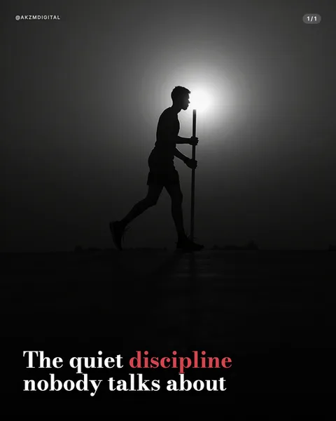
Noir builds the whole slide out of a single hard light source and a body reduced to pure silhouette. In this example a lone figure walks with a staff, but you cannot see his face, his kit, or any detail. He is a black cut-out against a burning white sun that flares behind him and bleeds a soft grey halo into the sky. Below the horizon everything collapses into near-total black, so his long shadow stretches across the ground as the only texture in the lower half. The palette is strictly monochrome: white light, greyscale gradient, and deep charcoal shadow with no colour anywhere in the photo itself. The one exception is the type. Set in a bold serif, the headline 'The quiet discipline nobody talks about' sits low in the dark, white on black, with the single word 'discipline' picked out in dusty rose red so it becomes the emotional hit of the slide. A small '1/1' pager and an @AKZMDIGITAL handle sit quietly in the corners. This is the language of high-contrast black and white photography, of Rembrandt lighting and film noir backlighting, of album covers and thoughtful reels that want to feel weighty rather than cheerful. It stops the scroll because the eye reads the bright sun first, then the human shape, then falls into the dark where the words are waiting. The mood is contemplative, solitary, a little serious. Nothing is bright or busy, so there is nowhere for the reader's attention to leak. It is a style for meaning, not for products, and it treats restraint as the point rather than a limitation.
Best for
The silhouette must hide the face, or it stops working
Noir depends on the figure being unreadable. The walking man here has no visible features, just an outline against the sun, and that anonymity is what lets the viewer project themselves into him. The moment the AI renders a lit face, an expression, or a recognisable brand of trainers, the slide becomes an ordinary photo with a caption. Push the light source directly behind the subject and let everything in front fall to solid black. Backlight, not portrait light, is the whole style.
One rose-red word is the entire colour budget
The photo is pure greyscale, so the single red 'discipline' does an enormous amount of work. It tells the reader which word carries the meaning and gives the eye its only splash of warmth in a cold frame. Spend that colour on the noun that matters most, never on a filler word like 'the' or 'about'. If you highlight two or three words the red stops meaning anything and the monochrome discipline of the style falls apart.
Wrong for anything that needs to look cheerful or literal
Noir is built for reflection: solitude, struggle, resolve, the quiet parts of a story. It is the wrong call for a product demo, a food post, a bright promotion, or a step-by-step tutorial where people need to see actual detail. A silhouette cannot show your ingredients, your interface, or your smile. If the reader needs information from the image rather than a feeling, choose a lit, literal style like Realism or Studio instead.