Golden Instagram carousel style
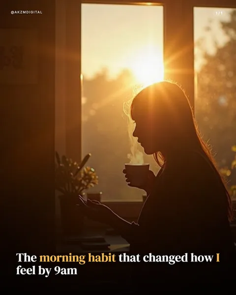
Golden is built entirely around backlight. In this slide the sun sits just behind a woman's head at a window, flaring into a hard starburst and rimming her hair and shoulder with a molten orange line. Everything else falls into warm shadow: her face is a near-total silhouette, her cup and hand read as dark shapes, and the steam rising off the drink catches the light as a thin bright thread. The palette runs amber to deep bronze with a blurred garden dissolving into bokeh through the glass. There is no colour outside the warm register, which is what gives the style its cohesion. Texture comes from the haze and the soft grain the low sun throws across the frame. The layout keeps type low and out of the light, bold serif set bottom-left with a single word, 'morning habit', and the 'I' picked out in the same gold as the sun so the copy and the image share one accent. A small '1/1' page marker sits top-right, the handle top-left. It stops the scroll because backlit silhouettes read as calm and intimate before you read a word, the visual shorthand of a quiet, private moment. The lineage is golden-hour lifestyle photography and the sun-flare aesthetic of film stills and wellness editorial, the kind of frame shot deliberately into the light rather than away from it. It evokes stillness, routine and self-care without stating them, which is why it suits reflective, first-person copy. This is a mood-first style: the picture carries the feeling and the text only needs to name it.
Best for
Shoot into the sun, or you lose the whole style
Golden only works when the light source sits behind the subject. The flare, the rim on the hair, the glowing steam, the silhouetted face all come from firing the camera straight at the sun. Turn the light around to front-light the subject and you get an ordinary warm photo with none of the intimacy. When you brief a slide, put the window or sun behind the person and let their front fall dark. The darkness is a feature, not a fault to correct.
Match your one highlight word to the sun's colour
Notice 'morning habit' and the lone 'I' are set in the same amber as the flare. That is the trick that makes the type feel native to the photo rather than dropped on top of it. Pick one gold from the image with a colour picker and use it for a single emphasis, never more. White for the rest of the line keeps it readable against the shadowed lower third. Two or three highlights and the discipline collapses into decoration.
Wrong for anything that needs a clear face or product
This look throws faces into silhouette and drowns detail in haze, so it is the wrong call whenever the reader must see something specific. Founder headshots, product shots, before-and-afters, recipe steps, anything with fine text on the object: all lost to the shadow. Golden sells a feeling, a mood, a quiet routine. If your slide needs to prove or show rather than evoke, pick a front-lit style like Studio or Realism instead and keep Golden for the reflective opener.