Retro Instagram carousel style
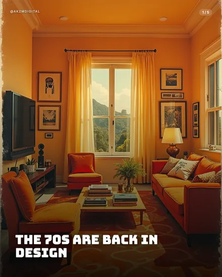
Retro bathes the whole frame in warm amber light, the sort of golden wash you get from an old Kodachrome slide left in the sun. This example shows a 1970s living room with orange walls, a burnt-orange sofa, mustard-yellow armchairs and a red patterned rug, all held together by a single hazy colour temperature that pushes everything towards honey and rust. There is no cool tone anywhere. The window glows white-gold, the lampshade radiates, and even the framed prints on the wall pick up the amber cast. Texture matters here: a soft film grain and a slight lens haze sit over the image, softening edges and giving it that developed-photograph feel rather than a clean digital render. The bold headline runs along the bottom in a heavy condensed sans-serif, all caps, tight and confident, printed in cream so it reads clean against the busy warm scene. The @AKZMDIGITAL handle and the 1/5 counter sit quietly in the top corners. The mood is nostalgic, cosy, sun-faded, unmistakably late-analogue. It draws directly on 1970s interior photography, vintage catalogue print and the colour science of early colour film stock, the palette of avocado, ochre and terracotta that defined the decade. That lineage does the emotional work: the reader feels warmth and memory before they read a word, which is exactly why a slide like this stops the scroll. It signals a story about the past, about taste, about a slower time, and it earns trust through familiarity rather than novelty. The look is confident enough to carry busy, detailed scenes because the unifying amber glow ties every element into one coherent frame.
Best for
The single amber colour cast is what makes it read as retro, not the furniture
Strip the honey wash and you just have a room. It is the unified warm temperature, everything pulled towards ochre and rust with no cool tones surviving, that reads as sun-faded film. When you generate slides, hold that consistency across the set. If one image drifts blue or grey it snaps the reader out of the decade instantly. Keep the whites warm, keep the shadows brown rather than black, and let the glow bind busy scenes together the way it does here.
Why cream condensed caps beat a period-accurate script font
You might be tempted to reach for a groovy 70s bubble typeface to match the era. Resist it. The example uses a heavy condensed sans in cream, and that contrast is deliberate. A modern, no-nonsense headline keeps the copy legible against a busy amber scene and stops the slide tipping into pastiche. The nostalgia should live in the image. Let the type stay clean and current so the message lands, then the visual does the time-travel.
When Retro is the wrong call: hard data and urgency
This look sells warmth, memory and taste, so it flatters interiors, food, culture and lifestyle beautifully. It actively works against you for anything that needs to feel current, precise or urgent. A pricing breakdown, a tech launch, a breaking-news update or a fitness metric will feel dated and soft under that hazy glow, undermining your own authority. If the topic is about the future or the numbers, pick a cleaner, cooler style and save Retro for stories that genuinely look back.