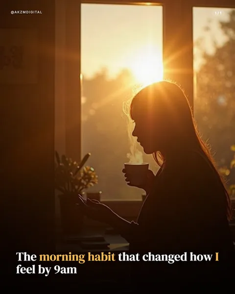
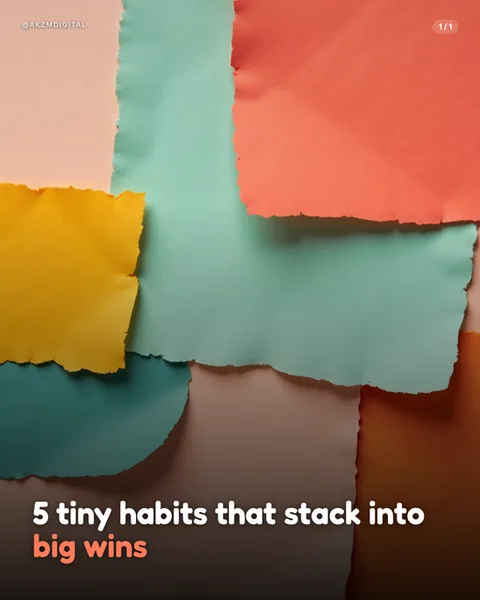
Grain Instagram carousel style
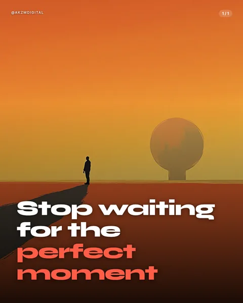
Grain builds each slide from a warm gradient wash and a single, near-silhouetted scene. In this example an orange sky bleeds from deep rust at the base up to a soft amber near the top, with a lone figure standing on a flat plain, a long shadow trailing behind them, and a hazy sun-sphere hovering to the right. Everything is rendered with a fine, dusty grain that softens edges and gives the whole frame the look of a printed poster rather than a clean digital render. There is almost no fine detail. The person is a flat dark shape, the horizon is a single line, and the mood carries the entire image. That restraint is why it stops the scroll. A minimalist, atmospheric scene reads instantly at thumbnail size, and the negative space at the bottom leaves a clean stage for type. The lettering here is heavy, rounded grotesque set tight and low, with "Stop waiting for the" in white and "perfect moment" dropped into the same orange-red as the ground, so the payoff line melts into the landscape. The lineage is clear. It borrows from mid-century travel and film posters, from Saul Bass style figure-in-a-void compositions, and from the grainy, sun-faded colour of expired film and risograph printing. It also nods to contemporary AI ambient art, the kind of quiet, contemplative single-subject illustration that populates mood boards and album covers. The overall feeling is calm, cinematic, a little melancholy, and made for a message about reflection or resolve. It is not a busy, information-dense style. Grain works when the emotion is the content and the words are few.
Best for
Why the figure has to stay a silhouette, not a portrait
The power of this look comes from the person being a flat, featureless shape against the wash. The moment you give them a face, clothes, or detail, the eye starts reading them as a specific character and the universal, everyone-is-this-person feeling collapses. Keep the subject small, dark and anonymous, standing in a lot of empty ground. The long shadow in this frame does the emotional work that a facial expression would in a photo. Let the pose, the scale and the space carry the mood, and resist any prompt that adds realism to the subject.
Colour the payoff line into the ground, not onto it
Here the closing words, perfect moment, are set in the exact rust-orange of the plain rather than white. That is the whole trick. The white lines state the setup plainly, then the key phrase sinks into the landscape so it feels like it belongs to the scene, not stuck on top of it. Pull your accent colour straight from the lower third of the image and use it on the two or three words that matter most. If every word is white, the slide is just a caption over a picture and the atmosphere goes flat.
When Grain is the wrong call
This style is built for a single feeling and a short line. It is wrong for anything with steps, stats, comparisons or dense teaching. A five-point how-to drowns because there is no room for structure and the grain fights small body text. It also suits reflective, aspirational or emotional messages, so a hard sales pitch or a technical tutorial will feel mismatched against all this dusk and quiet. If your slide needs a chart, a list or three columns, reach for Bento or Blueprint instead and keep Grain for the opener.