Thread Instagram carousel style
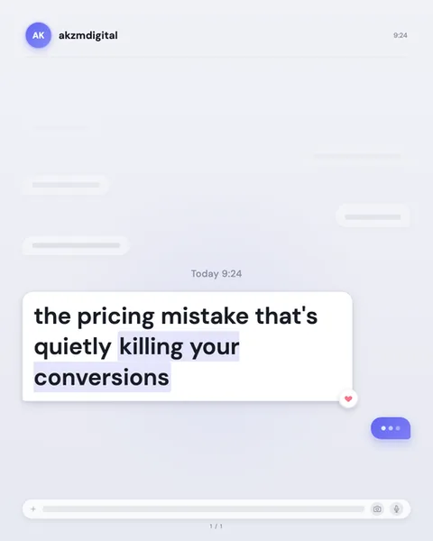
Thread stages your message as a conversation frozen mid-scroll. The image sets a soft lavender-grey chat window, with the sender's avatar top left, a purple circle reading "AK", and the handle "akzmdigital" beside it, timestamped 9:24. Behind the headline sit ghosted, blurred-out bubbles, grey speech shapes stripped of their text, so the eye reads "chat" instantly without a single legible word competing for attention. A centred "Today 9:24" divider grounds the moment. The headline arrives as one crisp white message bubble in heavy near-black type: "the pricing mistake that's quietly killing your conversions", with "killing your conversions" picked out in a pale lilac highlight like a selected passage. A tiny heart reaction clings to the bubble's lower corner, and a purple typing indicator with three dots hovers below, promising the next slide. A rounded input bar sits at the foot with a plus, a camera and a microphone icon. The lineage is obvious and deliberate: this is the iMessage and DM aesthetic, the visual grammar everyone reads fluently from their own phone. It stops scrolls because it disguises itself as a real chat, the format your thumb is already primed to open. The muted palette keeps it calm rather than shouty, and the typing dots exploit a genuine reflex, we wait to see what someone is about to say. Nothing here is loud. The power is in familiarity, in the sense that you have wandered into a private exchange rather than an advert. The blurred background bubbles do quiet, clever work, they imply a whole conversation without adding noise, so your one sharp sentence lands as the thing worth reading. It is intimate, immediate and unmistakably native to the feed it lives in.
Best for
The typing dots are a promise, so the last slide must not have them
That little purple three-dot bubble is the engine of Thread. It tells the reader someone is still writing, which is exactly why they swipe. Use it on every slide but the last. On your final card the dots should vanish and the input bar or a sign-off should take their place, otherwise you promise a message that never comes and the carousel feels broken. Treat the dots as a cliffhanger you are contractually obliged to pay off on the next slide.
Why the blurred background bubbles must stay unreadable
Look at the ghosted grey shapes behind the headline. They have no text, and that is the point. They read as "an ongoing conversation" at a glance while adding zero competition for the eye. The moment you put real words in them, the reader tries to read two threads at once and the headline loses. Keep the background bubbles empty, keep them soft, and let the single white message bubble carry all the meaning. The context is atmosphere, not content.
When Thread is the wrong call: anything that needs authority
This format whispers gossip. It works because it feels like a private DM, a mate telling you something. That intimacy is fatal for content that needs to feel official or credible: legal notices, medical claims, hard financial data, corporate announcements. A chat bubble makes a bold statistic look like hearsay. If your line needs to be trusted rather than overheard, reach for Gazette or Receipt. Thread is for the hook, the confession, the "you won't believe this", not for the proof.