Anime Instagram carousel style
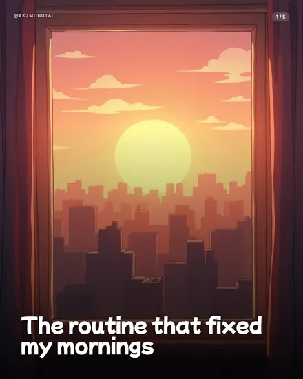
Anime renders each slide as a still from an animated film. The example is a sunset city skyline seen through a window, framed by heavy maroon curtains, with a soft yellow sun sinking behind layered building silhouettes. The palette is all warm gradient: coral pink at the top, amber in the middle, deep plum in the shadows of the foreground rooftops. Clouds are drawn as flat, cel-shaded shapes rather than photographed wisps, and the light glows rather than glares. This is the visual language of Japanese animation backgrounds, the "makurakotoba" establishing shots you see in the work of studios like Makoto Shinkai and Ghibli, where an empty room or a wide sky carries the whole emotional weight before anyone speaks. The layout keeps it clean: a small @AKZMDIGITAL handle top left, a 1/5 page counter top right, and the headline "The routine that fixed my mornings" set in a chunky rounded white sans at the bottom left, tucked into the darkest part of the scene so it stays legible. What stops the scroll is the mood. It feels nostalgic and calm and slightly cinematic, like a memory rather than an ad. The depth built from stacked, hazy building layers gives it real atmosphere, and the sun as a soft disc reads as hope, morning, a fresh start, which is exactly what a "fixed my mornings" hook wants to promise. The lineage is clear: TV anime key art, visual-novel backdrops, the "aesthetic" sunset edits that circulate on Pinterest and lo-fi playlists. It is illustration that carries feeling, not information, so it suits stories and reflections far more than data.
Best for
Let the empty sky do the talking, keep bodies out of it
The strongest Anime slides are establishing shots, not character portraits. This example has no people in it at all, just a room, a window and a skyline, and that is why it works. Anime backgrounds are built to hold a mood before dialogue arrives, so lean into wide, quiet scenes: a desk by a window, a train platform, rain on glass. The moment you crowd the frame with a detailed figure, the AI has to nail a face and a body, and small errors there break the spell instantly. Empty and atmospheric is safer and more evocative.
The sunset gradient is the emotion, so match your hook to it
Notice how the coral-to-amber-to-plum wash reads as morning, hope and a fresh start, and the headline is literally about fixing mornings. That alignment is not accidental. Anime lighting carries strong emotional coding: golden sunsets mean nostalgia and change, cool blue nights mean loneliness or study, overcast greys mean melancholy. Pick the palette for the feeling you want first, then write the hook to sit inside it. A hard, cynical or purely factual line fights the warmth of this glow and makes the slide feel confused.
When Anime is the wrong call
Skip this style for anything that lives on precision. Pricing tables, step-by-step tutorials, statistics, hard B2B credibility, product specs: the soft, dreamy render makes all of that feel less trustworthy, not more. Anime is also a poor fit if your brand needs to look grown-up and neutral, because the aesthetic carries a specific fandom association that not every audience shares. Use it for personal stories, morning and evening routines, reflections, gentle motivation and lifestyle content. If the point of the slide is a number or an instruction, reach for a cleaner, flatter format instead.