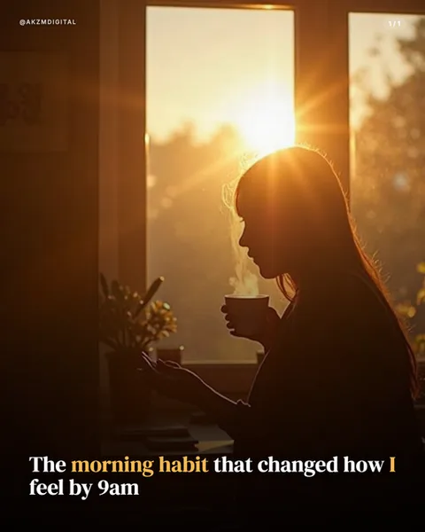
Linen Instagram carousel style
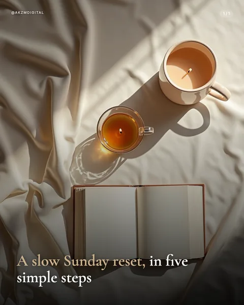
Linen is soft, warm and unmistakably lived-in. The whole frame is built on rumpled, cream-coloured fabric with deep folds catching a low, honeyed daylight that rakes across the scene from the top right. You can see the tradition it borrows from at once: this is the flat-lay, morning-light photography that fills lifestyle and wellness feeds, the kind of shot styled on a bed or a table by a window. Everything sits in a muted, oatmeal and taupe palette, warmed by the amber of tea in a clear glass cup and the milky brown of a latte in a ceramic mug. An open book, its blank pages facing up, anchors the lower third. The mood is calm, unhurried, almost sleepy. Shadows are long and soft rather than crisp, and the light does the storytelling, with a caustic ripple glowing through the glass cup onto the cloth. Type is set in an elegant serif, lowercase and restrained, sitting quietly in the bottom-left corner: 'A slow Sunday reset, in five simple steps', with the comma and a single phrase picked out in a warm brown to lift it off the cream. A small '1/1' and an @akzmdigital handle sit top-right in the same light hand. It stops the scroll precisely because it feels like a real, quiet moment rather than a graphic. The eye reads warmth, rest and permission to slow down before it reads a single word. This is the aesthetic of the morning ritual, the self-care caption and the cosy corner of Instagram, where texture and natural light carry more weight than any headline could.
Best for
Let the raking window light do the talking
The single most important thing in this look is that low, honeyed light coming in from one side and throwing long, soft shadows across the folds. It is what makes the fabric read as real linen rather than a flat beige background. If your prompt or crop flattens the light into even studio brightness, the whole mood collapses into a stock photo. Keep the source low and directional, keep the shadows long, and let one warm highlight fall across the props. Softness, not sharpness, is the entire point.
Serif type belongs in the corner, never the centre
Notice the headline sits quietly in the bottom-left, lowercase, in an elegant serif, with just the comma and one phrase warmed to brown. That restraint is deliberate. Linen is a photograph first and a poster second, so type should feel like a caption resting on the cloth, not a banner slapped over it. Centre it, bold it, or set it in a sans and you fight the calm the image worked to build. Keep it small, keep it warm, keep it out of the way of the light.
When Linen is the wrong call
This style sells rest, ritual and slowness, so it actively undercuts anything urgent or high-energy. Do not use it for a launch countdown, a limited-time offer, a hard sales pitch or a data-heavy explainer. The rumpled bed and cooling tea whisper 'no rush', which is exactly wrong when you need someone to act now. It is also a poor fit for tech, finance or anything that wants to feel precise and modern. Reach for a cleaner, colder style there and save Linen for content that genuinely wants to breathe.