Blueprint Instagram carousel style
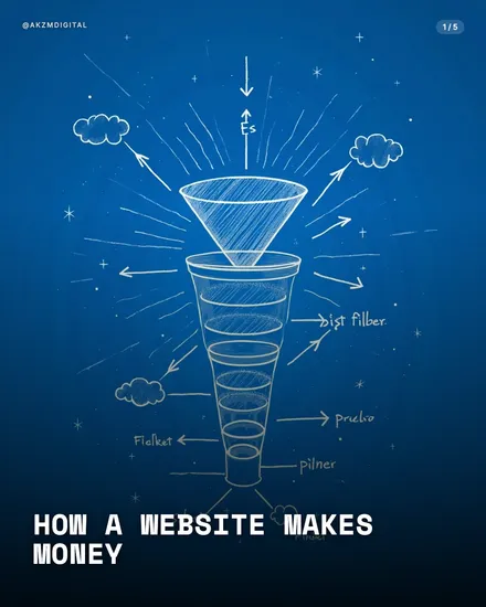
Blueprint takes the technical drawing tradition, the architect's cyanotype and the engineer's schematic, and turns it into scroll-stopping illustration. The example slide sits on a deep blue field that shades from near-black at the edges to a brighter cobalt behind the subject, exactly like light hitting a rolled-out blueprint. Every line is drawn in chalky off-white, sketched with the loose confidence of a hand annotating a wall of technical paper. The central conversion funnel is hatched and cross-hatched by hand, ringed with radiating sunburst strokes, floating clouds and small four-point stars that give the whole thing a diagrammatic, worked-out feel. Directional arrows point inward to hand-lettered labels, the sort of scrawled captions you'd find pencilled onto a working draft. It stops the scroll because it reads as thinking made visible. A blueprint promises that someone has taken a messy idea apart and drawn how it actually fits together, so the eye trusts it before the brain has read a word. The type follows suit: a chunky condensed sans in caps, "HOW A WEBSITE MAKES MONEY", set low like a title block on a drafting sheet, with a small slide counter top right and a handle top left where a drawing office stamp would sit. The mood is studious and slightly nostalgic, the technical illustration you'd see in an old physics textbook or a patent filing, updated for the feed. Because everything is monochrome blue and white, the diagram carries the whole slide with no colour distraction. This is a look built for explanation, for showing how parts connect, flow and stack. Where a photo would ask you to admire, a blueprint asks you to follow. That shift from spectacle to schematic is exactly what makes it feel authoritative rather than decorative.
Best for
The hand-drawn wobble is the whole trick, don't clean it up
Look at the funnel in the example: the hatching is uneven, the ellipses aren't perfectly round, the arrows are sketched not vector-straight. That imperfection is doing the work. A crisp, mechanically perfect diagram reads as a stock icon and the eye slides off it. The wobble says a person reasoned this out on paper, and that human authorship is what earns trust. When you build a Blueprint slide, resist the urge to tidy the lines into geometry. The chalky, slightly rushed quality is the difference between a schematic and clip art.
Blueprint is for systems, not for single objects
This style earns its keep when there are parts that connect: a funnel with stages, a flow with arrows, a machine with labelled components. The funnel example works because there is something to trace from top to bottom. Give Blueprint a single product shot or a lone portrait and it has nothing to diagram, so it just looks like a doodle on a blue background. Before you pick this look, ask whether your slide has moving parts worth mapping. If the answer is one idea, one object, no relationships, choose a photo style instead.
Keep labels short and let the arrows carry the sentence
On a blueprint the words are annotations, not paragraphs. The example uses tiny scrawled captions beside arrow tips, and that's the ceiling. Long body copy fights the drawing and breaks the illusion that these are pencilled notes on a working draft. Write your labels as a draughtsman would: a noun, maybe two words, pinned to the exact spot on the diagram it names. Put the actual explanation in the caption or the next slide. The blueprint shows the structure, your words just point at it.