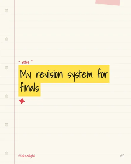
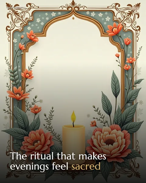
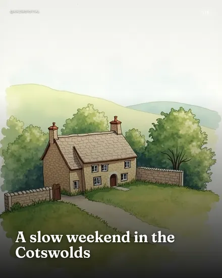
Chalkboard Instagram carousel style
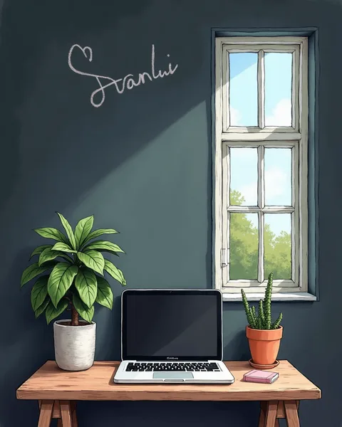
Chalkboard renders your scene as a hand-drawn illustration set against a deep slate-blue wall, the kind of muted teal-grey you'd find on a schoolroom board. In this example a wooden trestle desk holds a slim laptop, a potted broad-leaf plant, a terracotta cactus and a small pink notebook, all sketched with soft pencil-like outlines and gentle cross-hatched shading rather than flat vector fills. A white-framed sash window opens onto a bright sky with tree tops, casting a diagonal wash of daylight across the wall. The signature detail is the loose chalk-script word scrawled top-left, complete with a little hand-drawn heart, imitating the wobble of actual chalk on slate. The palette stays low and calm: dark wall, warm timber, sage greens, one accent of terracotta. Textures read as illustrated, not photographic, with visible paper grain and hand-shading that keeps everything cosy rather than crisp. It stops the scroll because it feels handmade and personal, like a café A-board or a cherished study nook someone actually chalked by hand. The lineage is clear: it borrows from cafe menu boards, classroom nostalgia, and the illustrated cosy-desk aesthetic popular in stationery and bullet-journal circles. The chalk-lettering headline sits naturally where a menu special or a motivational line would go, so the format invites short, warm, human copy rather than corporate statements. It suits topics about learning, routines, calm productivity and homely creativity, anywhere a warm hand-drawn feel beats a polished studio shot.
Best for
The chalk-script word is your only headline slot
See how the lettering sits alone on the upper wall, curled around a little heart. That hand-drawn script is the design's voice, and it can only carry a few words legibly. Write a short, warm phrase there, a name, a theme, a single promise. Cram a full sentence into that chalk and it turns to scribble. Let the illustrated scene do the explaining and keep the chalk line to three or four words that a reader could imagine someone actually writing by hand.
Why the muted slate wall needs one warm accent
The whole board sits in cool dark teal, which is calming but can go flat. The single terracotta cactus pot and the pink notebook are doing real work here, giving the eye a warm point to land on. When you plan slides in this style, keep that discipline: one or two warm objects against the cool wall. Flood it with bright colours and you lose the quiet chalkboard mood that makes the look feel handmade rather than busy.
Skip Chalkboard for anything urgent or data-heavy
This look is soft, cosy and slow. That is exactly wrong for launches, deadlines, sales countdowns or charts. The pencil shading and gentle daylight say relax, not act now, and a stat-heavy slide drowns in the illustrated clutter of plants and desk props. Use it for study tips, morning routines, journalling prompts and calm creative work. If your message needs a hard punch or a number front and centre, reach for a flatter, bolder style instead.