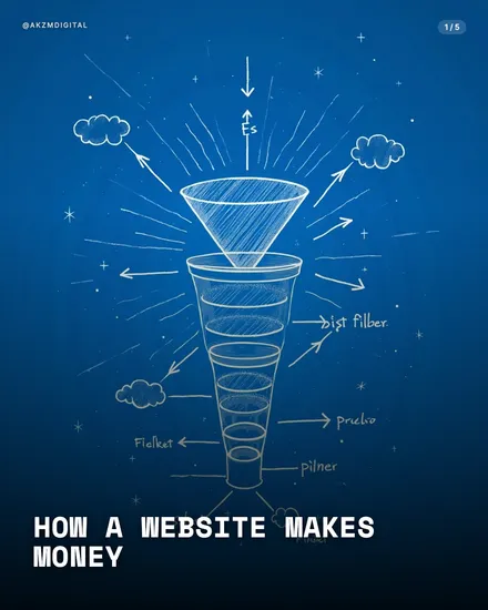
Isometric Instagram carousel style
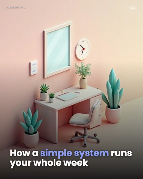
Isometric renders a small scene from a tilted 30-degree bird's-eye angle, so the whole workspace sits in a neat diamond on the page rather than facing you head-on. In this slide you get a tidy desk vignette: a pale grey desk and wheeled office chair, a framed mirror on the wall, a round wall clock, plug sockets, a notebook and pen, and four potted plants ranging from succulents to a tall snake plant. The palette is soft and warm, a peach-to-blush gradient washing the two visible walls, with muted sage greens and off-whites on the objects. Everything has the smooth, matte, slightly rounded finish of a 3D clay model, no harsh shadows, no photographic grain. The overall mood is calm, orderly and toy-like, a little world you could pick up and rotate. The caption sits in a heavy white sans-serif at the bottom, with 'simple system' picked out in periwinkle blue, resting clearly against the darker floor plane. It stops scrolls because the human eye reads an isometric diorama as a complete, solvable object, everything on show at once, nothing hidden. The lineage is unmistakable: this is the language of architectural axonometric drawing, of tabletop miniatures, and above all of the flat-design app illustration boom that filled SaaS landing pages and onboarding screens through the late 2010s. That association tells a reader 'this is clear, modern and systematic' before they read a word, which is why it pairs so naturally with process and productivity topics. The consistent lighting and single vanishing logic across slides make a carousel feel like one continuous, well-built set rather than a stack of unrelated frames.
Best for
Keep every slide locked to the same 30-degree tilt
The magic of an isometric carousel is continuity, the sense that each slide is another room in the same doll's house. That only holds if the camera angle never shifts. If one scene is rendered at 30 degrees and the next drops closer to a flat top-down, the eye reads them as two different worlds and the set falls apart. Fix the horizon and the diamond footprint first, then swap the props inside. Consistency of angle matters more here than consistency of colour.
One scene, one idea, or the diorama gets cluttered
This desk works because it says one thing: a calm, organised workspace. Isometric tempts you to keep adding objects, another plant, a lamp, a coffee cup, until the little world turns into a hoarder's shelf and the message drowns. Treat each slide as a single object doing a single job. If your point needs three items to land, cut it to one and let the empty floor plane breathe. The style rewards restraint far more than density.
Wrong for anything that needs a real human face
Isometric renders places and systems beautifully and people badly. At this tilt and scale, faces become tiny, generic and slightly uncanny, so emotional stories, personal brand posts or testimonials fall flat. If your topic hinges on a specific person, a founder, a customer, an expression, reach for an AI photo style instead. Keep isometric for the abstract and the structural: workflows, tools, spaces, before-and-afters, the how-it-fits-together content it was built for.