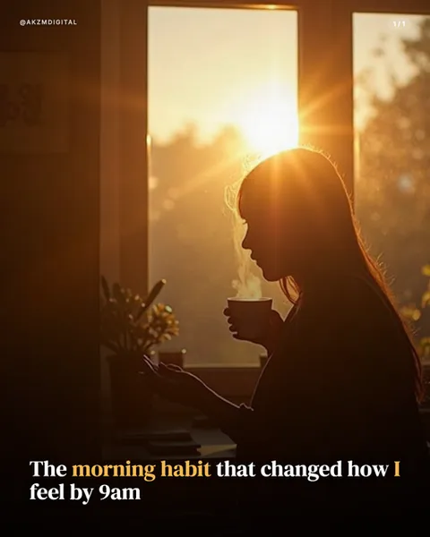
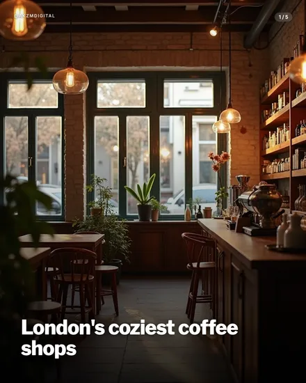
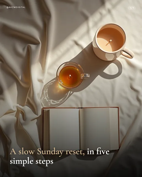
Cookbook Instagram carousel style
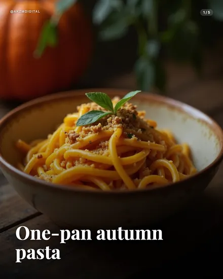
Cookbook is warm, appetite-first food photography dressed for the printed recipe page. The example shows a bowl of glossy autumn pasta, the strands coiled high and catching a soft golden light, dusted with crumbs and topped with a single sprig of mint for a fleck of green against all that amber. The bowl is speckled cream stoneware with a rustic rim, sat on a dark, grainy wooden table. Behind it a whole pumpkin and out-of-focus foliage sit in deep shadow, so the eye lands squarely on the food. The palette is all seasonal warmth: burnt orange, ochre, chestnut brown, with the background dropping to near-black. Texture does the heavy lifting here, you can read the sheen on the noodles and the coarse crumb topping. The type sits low and confident: a bold serif headline, 'One-pan autumn pasta', in clean white, styled like a chapter title rather than a caption. This is the visual language of the modern hardback cookbook and the food blog hero shot, descended from the moody, low-key styling that Donna Hay and countless Instagram food creators made a house style. It stops the scroll because it triggers hunger before the brain even reads a word, and the shallow depth of field plus the single garnish signals care, craft, a recipe worth saving. It feels shot on a real table by someone who cooks, not a stock library. The mood is homely and generous, the kind of image that makes you want to bookmark and make it this weekend.
Best for
The garnish is the whole trick, so use exactly one
That single mint sprig is doing enormous work: it breaks the wall of amber, adds a fresh green pop, and tells the viewer the dish is finished with intent. Cookbook shots fall apart when you scatter garnish everywhere trying to look abundant. One deliberate herb, one drizzle, one crumb topping. Restraint reads as expertise. Pile it on and the food starts to look styled by a machine rather than plated by a cook, which kills the homemade trust this style trades on.
Serve it steaming warmth, not clinical clarity
Notice the near-black background and the low golden light. Cookbook lives in shadow on purpose. The pasta glows because everything around it recedes. If you brighten the whole frame to show off, you lose the cosy, candlelit appetite appeal that makes people save the post. Keep backgrounds dark and out of focus, let the food be the only lit thing, and lean into browns, oranges and creams. This is comfort food photography, not a product catalogue lightbox.
Wrong for anything you can't put on a plate
Cookbook is built for food, drink and the occasional tablescape. Try to force it onto a fitness routine, a finance tip or a software feature and the recipe-page framing looks absurd. The bold serif chapter title only works when it sits over something edible and glossy. If your carousel isn't about eating or drinking, pick a general photo style. This one earns its keep purely on hunger, and hunger needs a bowl.