Realism Instagram carousel style
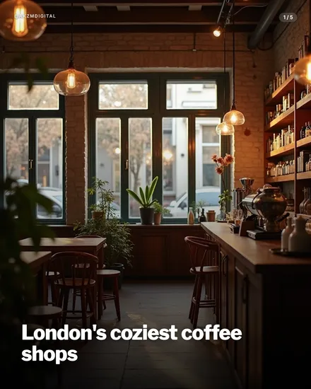
Realism looks like a photograph a good travel editor would actually run. The example slide is the interior of a London coffee shop, shot in warm ambient light with no obvious filter or stylisation. You can read every material: exposed brick warmed to a soft terracotta, dark timber tables and bentwood chairs, a run of bottle-lined shelves down the right wall, and a brass espresso setup catching the low light. Round glass pendant bulbs hang at staggered heights and glow a gentle amber, while the tall multi-pane windows pull in flat, overcast daylight from a street where bare trees and parked cars sit slightly out of focus. Potted plants soften the sill. The depth of field is shallow and believable, foreground foliage blurs at the left edge, which reads as a real lens rather than a render. The mood is quiet, lived-in, unhurried. Type is kept out of the way: a bold white sans-serif headline sits low in a darkened corner where the floor falls into shadow, so it never fights the picture. A small '1/5' counter marks it as a carousel. Nothing here shouts. It stops the scroll precisely because it does not look designed, it looks captured, and the eye trusts a photograph before it trusts a graphic. The lineage is editorial and documentary: the interiors photography of lifestyle magazines, estate and hospitality shoots, the natural-light食 café journalism you find in Sunday supplements and on well-run food Instagram accounts. It borrows the honesty of reportage without the harshness, favouring warmth and texture over drama. Where a stylised look announces its treatment, Realism hides the seams and lets the subject carry the weight, which is exactly why it suits places, food and moments you want people to believe are real.
Best for
Put the text where the room is already dark
This slide works because the headline sits in the bottom-left corner, over floor and shadow, not over the bright windows or the glowing shelves. Realism gives you an uneven canvas, so scout the image for its naturally dark, quiet zone before you place a word. Drop white type onto the busy, well-lit half and it turns to mush. Let the photograph keep its focal point, the espresso machine, the windows, and let type live in the negative space the light already left you.
One believable location beats five staged props
The credibility here comes from consistency: the brick, the pendants, the bottles and the street outside all belong to the same room, shot with one lens and one light. That is what makes it read as a real place rather than a stock composite. When you prompt for Realism, commit to a single coherent scene and let it breathe. The moment you cram in mismatched props or an impossible camera angle, the brain flags it as fake and the whole trust advantage collapses.
Wrong for anything abstract or aspirational
Realism is built to make a real thing believable: a café, a dish, a product, a place you could walk into. It is the wrong call for concepts, statistics, quotes or motivational lines, because there is nothing concrete for the lens to point at, and a photorealistic room behind an idea just looks like a slide grabbed the nearest background. If your carousel is about a feeling or a framework rather than a physical scene, reach for a graphic or illustrated style instead.