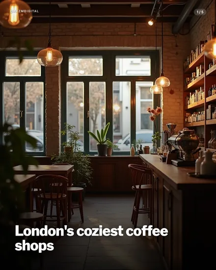
Lumen Instagram carousel style
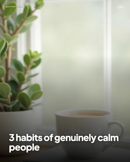
Lumen is soft, diffused daylight made into a photograph. The example slide shows a jade plant in a white pot beside a pale ceramic cup of coffee, both sitting near a frosted window that floods the frame with hazy, milky light. Nothing is sharp except the nearest leaves and the rim of the cup. The background dissolves into a green and white blur, a shallow depth of field that keeps the eye close and calm. The palette is muted and low-contrast: sage green, cream, warm off-white, with no hard blacks and no saturated colour anywhere. Highlights bloom gently rather than clipping. It feels like a quiet morning, the kind of scene you get in slow-living and wellness photography, or a Kinfolk spread, or a well-lit café shot on a fast lens. Texture is minimal by design, the frosted glass and the fog of bokeh do the work. The type is the giveaway of the format: a heavy white sans-serif set low in the frame, bottom-left, reading '3 habits of genuinely calm people', with a small '@AKZMDIGITAL' handle top-left and a '1/5' counter top-right. That bold caption anchored against airy negative space is what stops the scroll, the words feel grounded while the image breathes around them. The lineage is natural-light lifestyle photography and the muted, aspirational feed of wellness Instagram: bright but never harsh, styled but never staged to look expensive. It reads as sincere, unhurried and human. Where cinematic styles chase drama and studio styles chase product gloss, Lumen chases stillness. It suggests the reader can slow down, which is exactly the promise most self-improvement and mindful-living content is trying to make in the first place.
Best for
The haze is the point, so resist the urge to sharpen
Look at the slide: only the front leaves and the cup rim are in focus, everything else melts into fog. That softness is what signals calm. If you brief the image toward crisp detail and even lighting, you get a stock photo, and the mood collapses. Keep the shallow depth of field, the blown-out window, the low contrast. A little blur reads as breathing room. Lumen works because it looks like a real moment half-noticed, not a scene arranged and lit to be fully seen.
Set the caption bold and low, never over the bright glass
The white type sits bottom-left, over the darker cup and cloth, not floating in the pale window where it would vanish. That placement matters. Lumen images are mostly light, so your text needs a naturally darker corner to land on, or a subtle scrim. Keep the caption heavy and short, two lines at most. The weight of the sans-serif is the only firm thing in a soft frame, and that contrast between solid words and hazy scene is what makes the promise feel steady.
Wrong for urgency, launches or anything with a hard number
This style whispers. That is fatal for a flash sale, a countdown, a bold statistic or a confrontational hook. The muted greens and diffused light tell the reader to slow down, which directly undercuts 'act now' or 'only 3 spots left'. If your carousel needs energy, tension or a shout, pick Volt or Cinematic instead. Lumen belongs to content that rewards stillness: reflection, gentle advice, routines. Force it onto high-pressure copy and the visuals argue with your words.