Ink Instagram carousel style
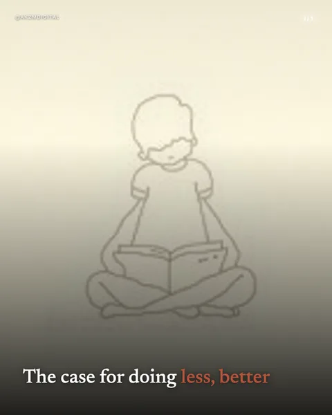
Ink strips illustration back to a single continuous line. In this slide a child sits cross-legged reading a book, drawn entirely in a thin, uniform grey-brown contour with no fill, no shading, and no colour inside the shapes. The line has the confident economy of a one-stroke sketch: the shoulders, the puffed sleeves, the folded legs and the open book are all suggested rather than detailed, and the face is left almost blank apart from a soft downward gaze. The background is not white but a warm graduated wash that darkens from a pale cream at the top to a smoky taupe at the base, giving the drawing a quiet, meditative haze. Type sits at the very bottom in a classic serif, 'The case for doing' in near-black and 'less, better' in a muted terracotta, the only warm accent in the frame. That restraint is exactly why it stops a scroll: in a feed of saturated photos and busy graphics, a single spare line drawing floating in fog reads as calm, intentional, almost hand-made. The lineage is life-drawing and continuous-line portraiture, the gesture sketches artists make to capture a pose in one movement, crossed with the muted tonal grounds of charcoal studies. It also nods to the pared-back editorial illustration you find beside long-form essays, where the picture is a mood, not an explanation. Everything here is about absence: what is left out lets the reader project stillness and thought onto the figure. The warm gradient does the emotional work a photograph would normally do, while the line does the storytelling. It is a style that trusts white space and a single delicate stroke to carry a whole idea, which is why it suits reflective, slower-paced writing rather than loud sales messaging.
Best for
The blank face is the point, don't ask AI to add features
Notice the child here has barely a suggestion of eyes and mouth. That emptiness is what lets a reader see themselves, or their own quiet moment, in the figure. The instant you prompt for detailed features, expressions or textures, the line loses its meditative anonymity and starts to feel like a cartoon. Keep the figure gestural. One pose, one continuous contour, no interior detail. If you find yourself wanting a recognisable individual, Ink is fighting you and you want a photo style instead.
Let the gradient carry the mood the line refuses to
The drawing itself is neutral. All the feeling comes from that cream-to-taupe wash behind it, warm, hazy, a little melancholic. This is where you set tone: a pale, cool ground reads clinical, a warm smoky one like this reads contemplative and gentle. Pick the gradient to match the emotion of the sentence, not the colour of the object. Because the figure gives you almost nothing, the background is doing the entire atmospheric job, so treat it as a deliberate choice rather than a default.
Wrong for anything that needs to show a product or a face
Ink cannot render a specific person, a branded object or a step-by-step demonstration. There is no fill, no colour coding, no detail to point at. If your carousel sells a physical product, teaches a UI, or needs a recognisable founder in frame, this style will read as vague and evasive. It shines on abstract, reflective, essay-style ideas about attention, rest, focus, feeling. The moment you need to prove something concrete, reach for a Realism or Studio photo instead.