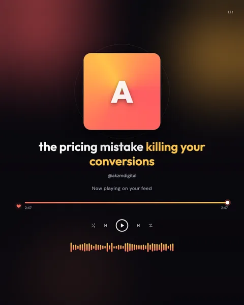
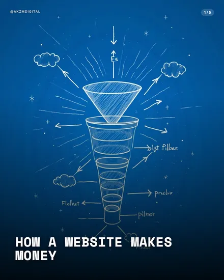
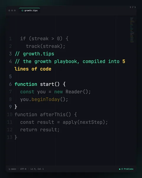
Route Instagram carousel style
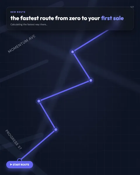
Route renders your content as a navigation app in the middle of plotting a journey. The image shows a dark navy canvas overlaid with a faint street grid, angled light beams and named roads set at a tilt, MOMENTUM AVE and PROGRESS ST, exactly the way a map app labels the streets under your route line. A bright periwinkle path zigzags up the slide, kinked at numbered waypoints from 1 at the bottom to 4 near the top, each node a soft glowing circle. At the top sits a rounded search card with a NEW ROUTE tag, a headline where the last two words, "first sale", are picked out in the same blue, and a greyed subline reading "Calculating the fastest way there...". A pill-shaped "START ROUTE" button with a play triangle anchors the bottom left. The visual lineage is obvious and deliberate: this is the turn-by-turn aesthetic of Google Maps, Citymapper and Waze, the dark-mode driving screen you glance at on a night journey. The glow on the route line and the tilted map plane borrow from that GPS-at-night feeling. Because the format is literally a set of ordered waypoints, it stops the scroll by promising a sequence with a destination. The reader already knows how to parse it. They have followed a blue line to somewhere hundreds of times. Type is clean and sans-serif, spacing is generous, and the whole thing feels calm and directional rather than busy. It works best when your content genuinely is a path: steps, stages, a before-to-after progression. The numbered nodes do the storytelling, and the accent-blue highlight on the headline tells the eye where the journey ends before they have even swiped.
Best for
Every waypoint number is a promise you have to keep
The route line shows four numbered nodes climbing from PROGRESS ST to the destination. That count is a contract. If slide one shows waypoints 1 through 4, the reader expects four stops and a real arrival, not three tips and a sales pitch. Map your content to the nodes before you write a word: one clear idea per waypoint, each one closer to the goal than the last. A route that loops back on itself or ends nowhere breaks the whole metaphor, because nobody follows a GPS that recalculates forever.
The highlighted destination word should be the payoff, not the topic
In the header card, only "first sale" is picked out in route-blue. That colour is the finish flag. Reserve it for the outcome your reader actually wants, the thing waiting at the end of the line, not for the subject of the carousel. If your headline is about email marketing, don't highlight "email", highlight the result it leads to. The accent tells the eye where the journey ends. Point it at the reward and the reader will swipe to reach it.
Wrong for anything without a start and an end
Route falls apart the moment your content isn't a journey. A list of unrelated facts, a mood board, a single strong opinion, a myth-busting piece where order doesn't matter, all of these fight the format, because the blue line insists everything connects in sequence and builds toward a destination. If your ideas are peers rather than steps, the numbered waypoints will feel arbitrary and the reader will sense the metaphor is fake. Use Tierlist or Bento for parallel items. Save Route for anything you would genuinely describe as getting from A to B.