Tierlist Instagram carousel style
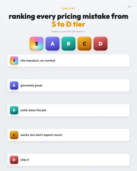
Tierlist takes the gamer ranking board and cleans it up for the feed. The header stacks a small orange eyebrow label, TIER LIST, above a heavyweight black headline, with the tier range picked out in bright amber, S to D tier. Under it sits a faint grey instruction line, Swipe to see the full board, and a page counter in the top corner. The signature element is the row of rounded gradient badges: a rainbow-swirled S, a violet A, a teal B, an amber-orange C and a red D, each a soft-cornered square with a glossy sheen. Below, every tier gets its own wide white card floating on a pale grey background, with a shadow soft enough to feel like a physical chip on a magnet board. The colour logic is deliberate and universal: green-blue for good, orange for middling, red for skip. Type is a single bold sans throughout, no serifs, no decoration, so the badges carry all the colour. The mood is playful but organised, opinionated without shouting. The lineage is obvious to anyone who has spent time on YouTube or Reddit: the tier list meme, born from fighting game character rankings and now used to rank everything from snacks to sitcom characters. That familiarity is the point. A reader knows how to read it before they read a word, and they instinctively want to argue with your placements. It stops the scroll because it promises a verdict, a hierarchy someone has committed to, and human beings cannot resist checking whether their favourite thing landed where it should.
Best for
The S tier badge gets the rainbow gradient for a reason
Notice that only S carries the multi-colour swirl while A through D get flat single colours. That is not decoration, it is signalling. The rainbow reads as special, prismatic, above the ordinary scale, so the eye lands there first and the reader immediately wants to know what earned it. When you fill this out, put your most surprising or most contested pick at S. If your top slot is the obvious answer everyone expected, the whole board feels flat and no one swipes.
Your tier labels have to be voice, not just letters
This example never leaves a tier blank. Each one gets a verdict written in plain human speech: the standout no contest, solid does the job, works but don't expect much, skip it. That phrasing is what turns a colour chart into an opinion. Write your labels the way you'd rank things out loud to a friend. Generic descriptors like good, average, poor waste the format. The letters give structure, the words give you a personality worth following.
Skip Tierlist if your topic has no losers
This format only works when things genuinely deserve different rankings. A tier list of pricing mistakes works because some mistakes are worse than others. A tier list of your five services, all of which you're trying to sell, collapses instantly, because you can't honestly put your own product in D and you can't put everything in S without the board looking like a lie. If nothing on your list belongs at the bottom, use a plain list or a Bento grid instead.